Unity and Variety
How to make a design feel like one thing without making it boring.
Unity and Variety
A whole city painted one colour
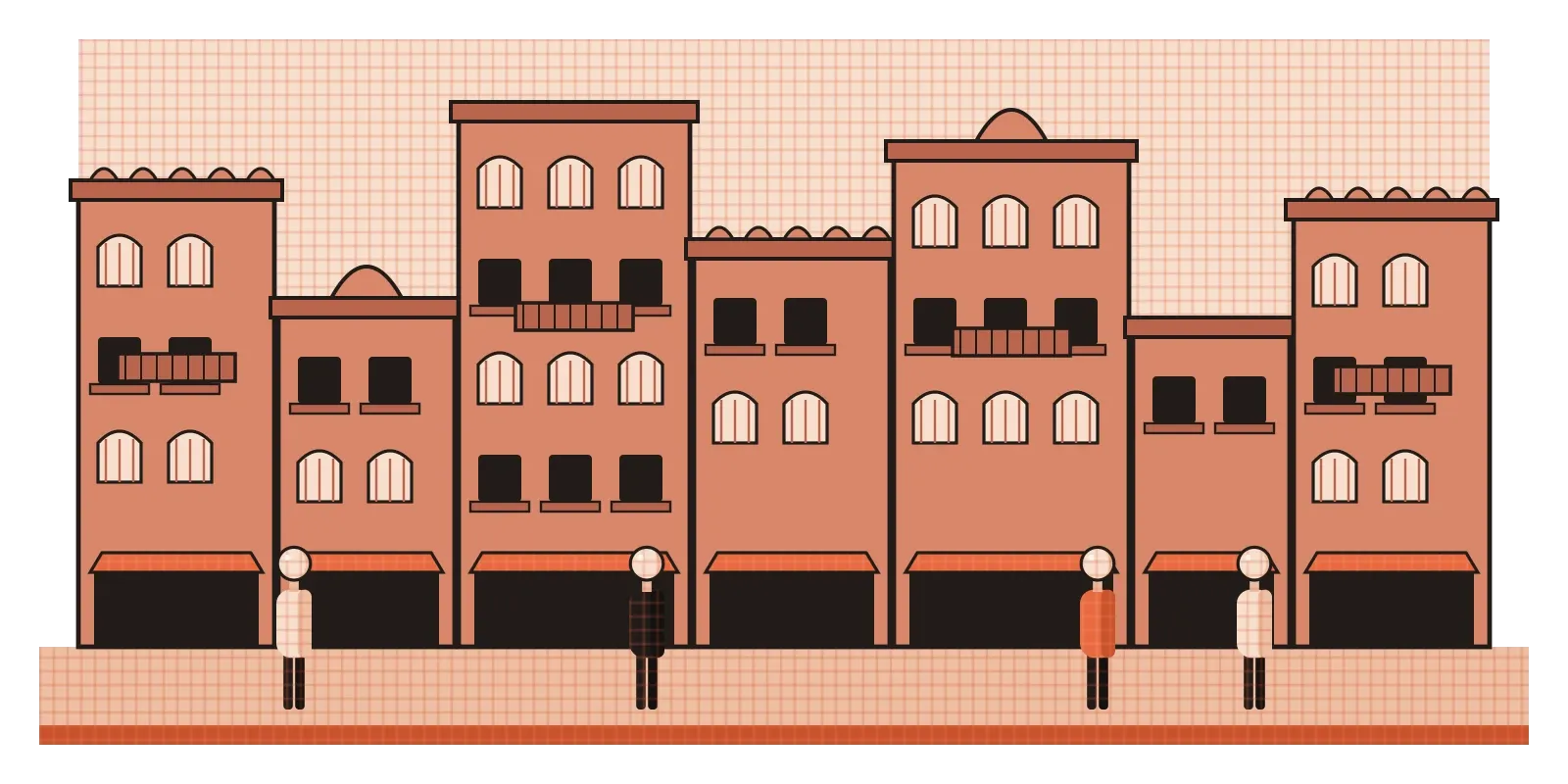
The old walled city of Jaipur is famous for its colour. Most of the buildings along its main streets are painted in the same terracotta pink, which is why Jaipur is often called the Pink City. The tradition is usually traced back to 1876, when the Maharaja of Jaipur, Ram Singh II, had the city painted pink to welcome a royal visit from Britain's Prince of Wales, the future King Edward VII, since pink was seen as a colour of hospitality. Later rules required buildings in the old city to keep the colour, and much of it is still pink today.
What makes the Pink City such a good place to think about design is that it isn't all the same. Walk down its bazaars and you'll find buildings of different heights, widths and ages, with arched doorways, carved balconies, latticed windows, small temples, shop fronts and overhanging jharokhas. No two facades are exactly alike. And yet the whole street feels like one place, because the colour, the materials and a few repeated architectural details hold everything together. If every building were identical, the city would feel like a barracks. If every building were painted a different colour in a different style, it would feel chaotic. The magic is in the balance between the two, and designers have names for both sides of it: unity and variety.
Unity: making many parts feel like one thing
Unity is the sense that all the parts of a design belong together. When a design has unity, it feels complete and intentional, as if everything in it was chosen as part of one idea. When it doesn't, it feels like a collage of separate decisions, even if each individual part is well made. You've probably seen websites like this, where every section seems to come from a different template, with different fonts, button styles and image treatments. Nothing is exactly wrong, but nothing feels like it belongs.
Designers build unity using many of the principles covered earlier in this series. Repetition is the most direct tool. Using the same colours, typefaces, shapes and spacing throughout a design tells the viewer that everything is connected. Proximity helps too. Elements placed close together read as a group, while scattered elements feel separate. Alignment creates invisible lines, as I described in the post on line, that tie elements together across a page. A consistent style of imagery, whether that's photographs with the same kind of lighting or illustrations drawn in the same manner, makes a whole set feel like a family. Even a shared idea can create unity, such as a theme or a story that runs through every part of a campaign.
It's worth noticing that unity isn't the same as sameness. The buildings in Jaipur are unified by their colour and certain details, not by being identical. In the same way, a poster can contain a photograph, a headline, a block of text and a logo, all very different kinds of element, and still feel unified because they share a palette, line up along the same edges and follow a clear hierarchy. Unity is about relationships between parts, not about making every part look alike.
Variety: what keeps unity from becoming boring
If unity were the only goal, every design would end up as one colour, one font and one repeated shape. That might be very unified, but it would also be dull. Variety is the opposite force, the introduction of differences that keep the eye interested and help it tell one thing from another. Changes in size, colour, shape, texture or rhythm give a design energy and create the contrast that, as I wrote in the post on contrast, is what makes anything noticeable at all.
The risk of too little variety is easy to see in parts of many modern cities. Rows of identical apartment blocks, with the same windows, the same balconies and the same colour repeated across a whole neighbourhood, can be efficient to build, but they're often hard to navigate and hard to love. People struggle to tell one building from another, and the place can feel anonymous. The same thing happens in interfaces. A screen made of identical cards, all the same size and colour, with no images and no variation in emphasis, forces people to read every card to find the one they need. Variety would help them spot the difference at a glance.
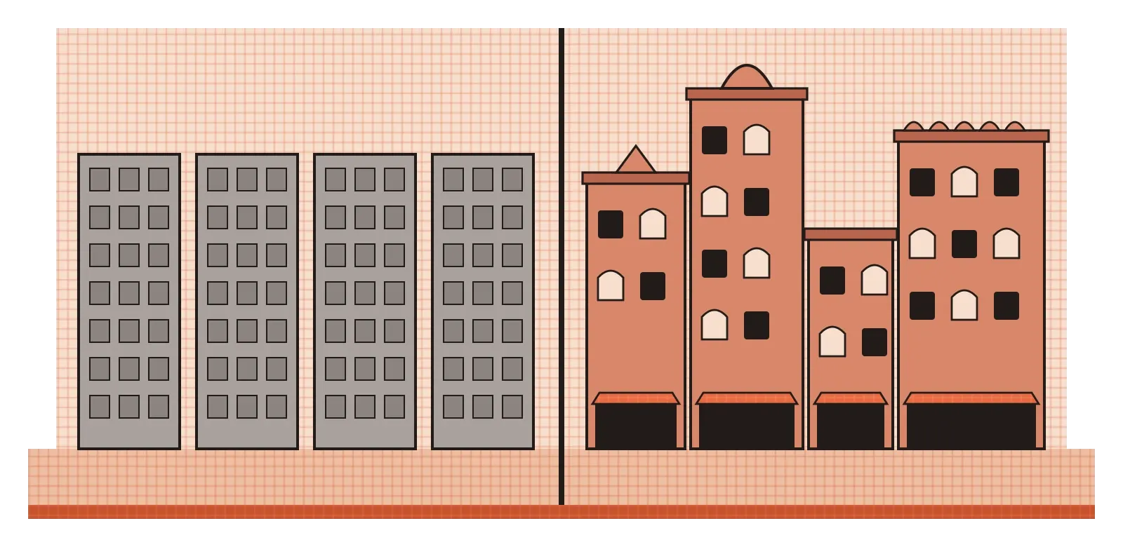
Too much variety has the opposite problem. When every element looks different, nothing seems connected, and the viewer has to work hard just to understand what goes with what. It's a bit like a conversation where someone keeps changing the subject. Each sentence might be interesting, but you lose the thread. Good variety is controlled. It happens within a set of shared rules, so the differences feel like meaningful variations on a theme rather than random noise.
Uniformity amidst variety, and a plate of food
Philosophers have been thinking about this balance for a long time. In 1725, the Irish-Scottish philosopher Francis Hutcheson published one of the earliest books in Britain about the nature of beauty. He argued that what we find beautiful is "uniformity amidst variety". The more variety something holds together within a clear sense of order, he suggested, the more beautiful it seems. A square, in his view, was more pleasing than a triangle partly because it combined more parts with equal regularity, and the natural world was beautiful because it showed enormous variety held together by consistent patterns and laws. You don't have to accept every detail of his argument to see that the core idea has lasted. Designers still talk about unity and variety in almost exactly those terms.
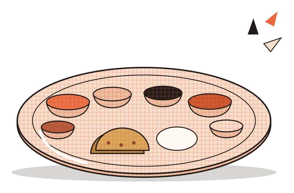
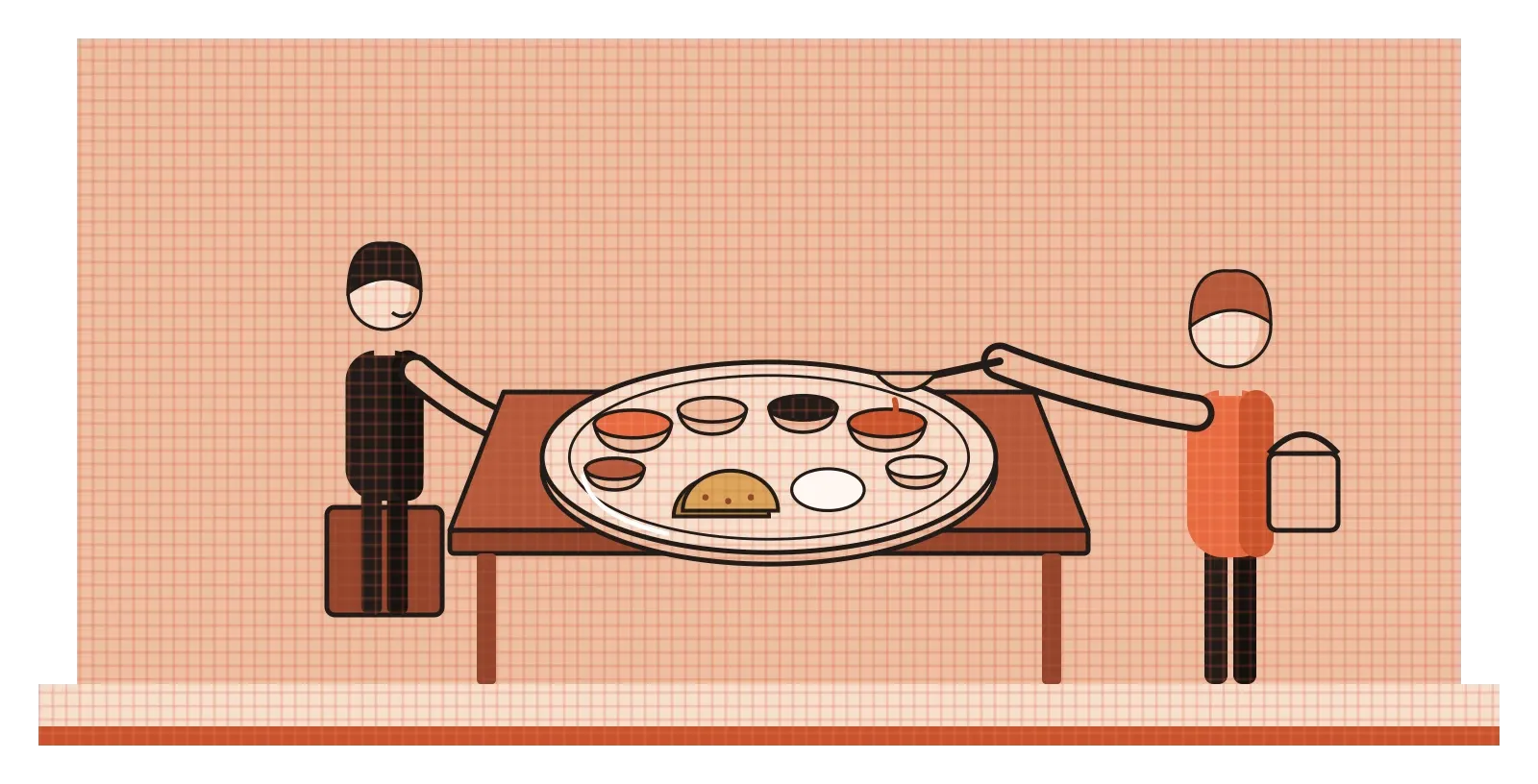
The best everyday example I can think of is a thali. A traditional thali brings together many small dishes on a single plate: a dal, one or two vegetables, a curd dish, rice or rotis, a pickle, perhaps a sweet. Each one has a different colour, texture and taste, sour, spicy, sweet, crunchy, soft, cool. That's a lot of variety, and it's what makes a thali exciting to eat. But it also has a strong unity. The dishes come from one regional cuisine, share related spices, sit in matching bowls around one round plate, and are meant to be eaten together, with each mouthful balancing the last. A thali where every bowl held the same dish would be monotonous. A plate piled with random foods from ten different cuisines would be confusing. A good thali sits right in the middle.
That's a useful way to picture what designers are aiming for. Lots of different elements, each with its own character, held together by a shared frame, a consistent set of rules and a clear sense that they belong on the same plate.
How systems hold the balance
In larger projects, unity and variety are usually managed through systems. A brand identity is a good example. A company might define a set of colours, a few typefaces, a logo, a style of photography and some rules about layout. Those rules create unity, so that a billboard, an app, a shopping bag and an email all feel like they come from the same place. But the rules also leave room for variety. Different campaigns can use different images, different headlines and different combinations of the brand colours, so the brand stays fresh without losing its identity. The best brand systems are strict about a few things and flexible about the rest.
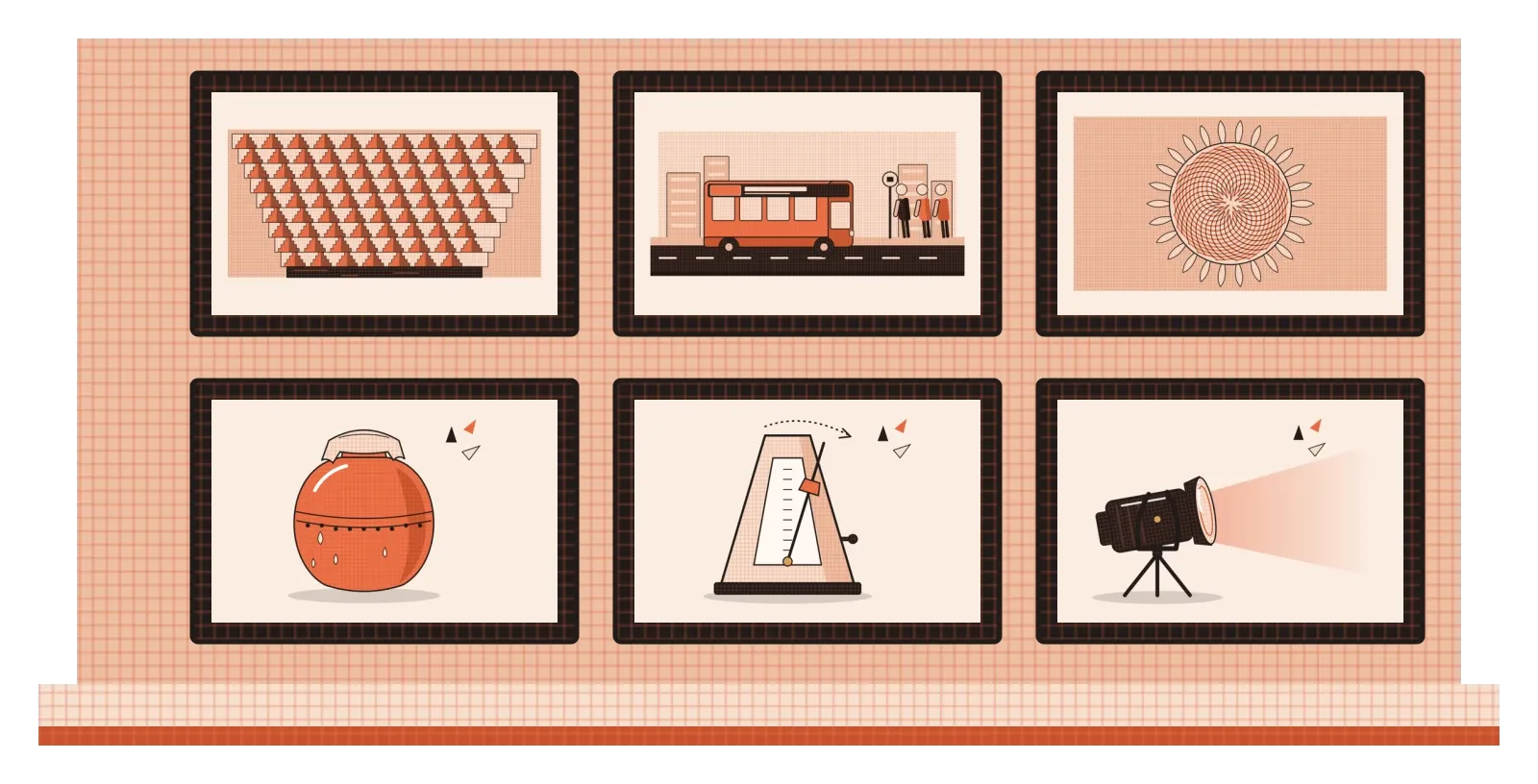
The illustrations on this blog work in a similar way. Every image follows the same few rules: a flat style, the same small palette of cream, peach, burnt orange and black, a fine graph-paper grid texture on the main surfaces and small spark shapes near the focal point. Those shared rules give the whole set unity, so any one image is recognisably part of Thoughtcloud. The variety comes from the subjects. One post has a stepwell, another a clay matka, another a sunflower or a bus. Because the style stays consistent, the subjects can be as different as they need to be without the blog ever feeling messy.
Digital products use design systems for the same purpose. A shared library of buttons, cards, icons, colours and spacing rules makes sure that every screen feels like part of the same product, even when different designers build them. Within that system, each screen can still have its own layout and content. When a team skips the system and designs every screen from scratch, variety creeps in by accident, and the product starts to feel stitched together. When a system becomes too rigid, every screen looks the same and nothing stands out. Maintaining a good system is really an ongoing negotiation between unity and variety.
Decide what stays the same, then let the rest vary
Unity and variety might sound like two separate principles, but really they're two sides of the same decision. Every design has to decide what stays consistent and what's allowed to change. Too much consistency and the result is monotonous. Too much change and it falls apart. The skill lies in finding the balance that suits the purpose. A government form might lean heavily towards unity, because predictability helps people fill it in correctly. A music festival poster might lean towards variety, because energy and surprise are part of the message. Most designs sit somewhere in between.
The habit I'd suggest is to make that decision explicitly. Before starting a project, write down the few things that will never change, such as the palette, the typefaces, the grid and the style of imagery, and a few things that are free to vary, such as layouts, subjects and accent colours. When you review your work, look at it as a whole rather than piece by piece. Does everything feel like it belongs to the same family? Is there enough difference between parts to keep things interesting and to help people tell them apart? If one element feels like it wandered in from another project, pull it back towards the shared rules. If everything feels flat and repetitive, look for a place where a controlled variation could add some life.
Jaipur's Pink City has been holding this balance for well over a century. Its streets are full of different buildings, shops and people, yet they read as one place because of a single shared colour and a handful of repeated details. That's what unity and variety look like at their best: enough of a common thread that everything belongs together, and enough difference that every part is still worth looking at.
Further reading: Francis Hutcheson, An Inquiry into the Original of Our Ideas of Beauty and Virtue (1725) · Ellen Lupton and Jennifer Cole Phillips, Graphic Design: The New Basics (2008) · Alina Wheeler, Designing Brand Identity (2003)