Here's a fun fact about design portfolios:they all show you the same thing.

The polished flow. The before/after. The one hero screen everyone put on a pedestal. What they don't show you is everything that happened around that screen. The audits nobody asked for. The PRs raised at midnight because a button was two pixels off and it was driving me insane. The tool built at 2am because doing something by hand for the fortieth time felt like a personal failure.

This section is that stuff. The unglamorous 80% that makes the glamorous 20% actually work.

The audit nobody asked for

So here's the thing about shipping fast: things break, quietly, and nobody notices until a hundred small breaks start feeling like one big one.

Spacing drifts. A component gets used one way on the onboarding screen and a slightly different way three screens later, and somehow both versions ship. A state breaks and just... stays broken, because nobody's job is to notice. Copy says "delete" in one place and "remove" in another, and you'd be amazed how much that quietly annoys people.

None of this is a crisis. That's exactly the problem. Nothing about it screams "fix me," so it never gets fixed, it just accumulates until the product feels slightly off in a way users can't quite name.

I decided to name it. A full screen-by-screen audit, everything logged, tracked, status and owner against every single item. 150+ inconsistencies found and fixed, working with developers wherever it needed real engineering muscle.

And the wildest part wasn't the number. It was the feedback afterward. Users started messaging in unprompted, saying the app just felt better, smoother, like something had been quietly sanded down. A few even started sending in their own list of annoyances. The audit stopped being my project and turned into something the users wanted a piece of too.
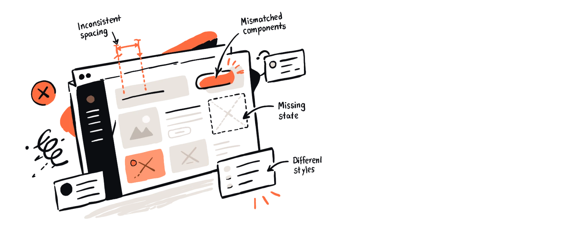
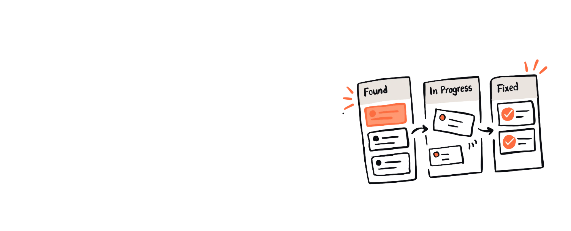
Sketch of an app screen annotated with inconsistent spacing, mismatched components, a missing state and different styles.A three-column board moving audit items from Found to In Progress to Fixed.

The fixes too small to bother anyone with

There's a particular kind of guilt that comes with knowing about a bug and not fixing it.

Not the big ones, those get tickets, get triaged, get fixed. I mean the small ones. A hover state that lags by a beat. A tooltip that clips against the edge of the screen on smaller viewports. A button that's technically clickable but visually looks disabled. Every designer has a mental list of these. Mine kept growing, and every time I brought one up, the answer was some version of "yeah, we know, it's just not a priority right now." Fair. It shouldn't be. Nobody should stop a sprint for a tooltip.

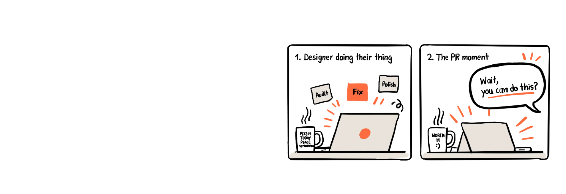
But "not a priority" and "doesn't matter" aren't the same thing. So I stopped asking. I started opening the codebase myself, fixing the issue, and raising the PR directly, no meeting, no ticket, no waiting for a slot in someone's sprint. The first few felt like trespassing, honestly, like I was stepping into territory that wasn't mine. Then a developer reviewed one of my PRs and just left a comment: "wait, you can do this?" That was the moment it stopped feeling like trespassing and started feeling like the job.

100 issues fixed this way. None of them individually impressive. All of them, together, the difference between a product that works and a product that feels considered.

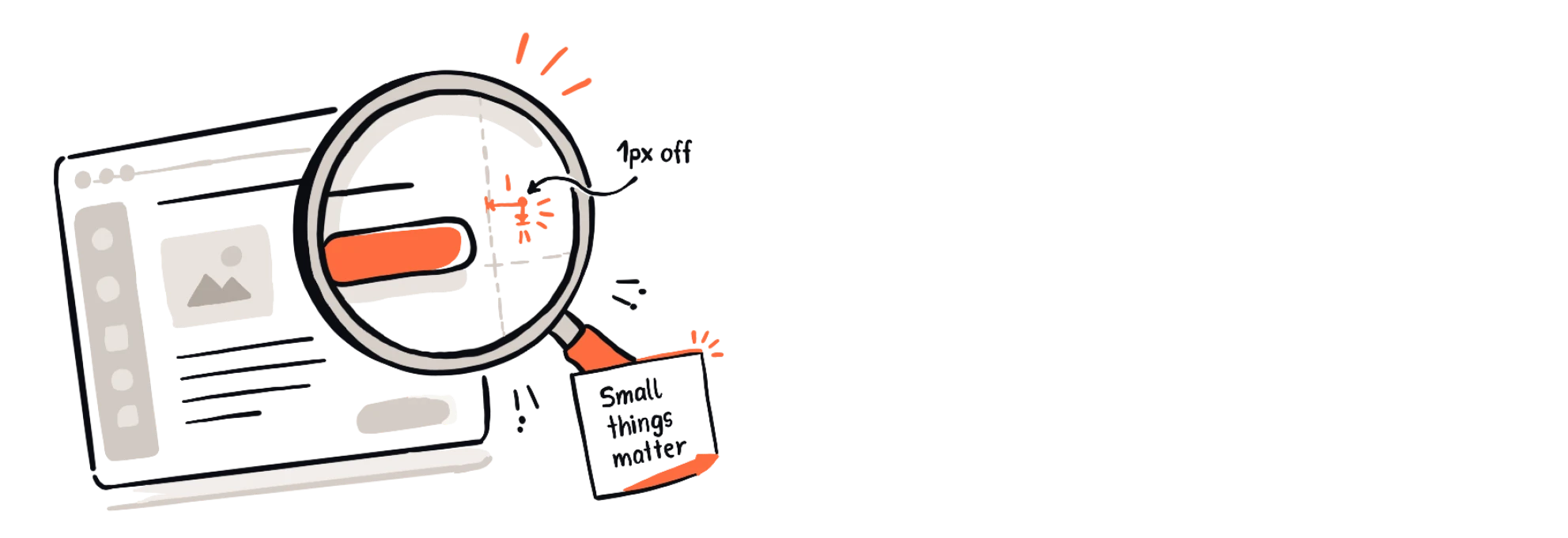
A magnifying glass over an interface revealing a button that is 1px off, with a note saying small things matter.Two-panel comic: a designer doing their thing, then a developer reacting to the PR with "Wait, you can do this?"

Making "pixel perfect" actually mean something

Ask any designer what their least favorite sentence in the English language is. A good number will say: "can you just nudge this 4 pixels?"

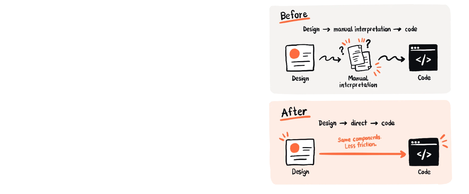
It's not really about the 4 pixels. It's about the fact that this conversation happens constantly, on every project, forever, because design files and code have never actually spoken the same language. A designer draws intent. A developer interprets it. And somewhere in that translation, things get lost, rounded, approximated. "Pixel perfect" gets used in every portfolio and every job posting, and it is, almost without exception, a lie everyone's agreed to tell.

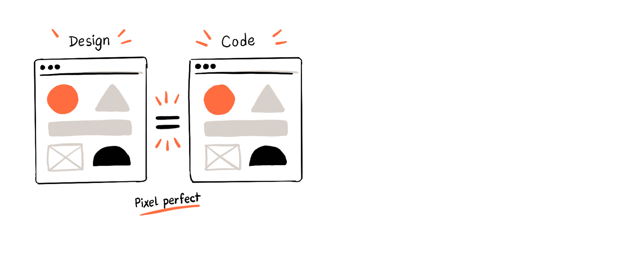
I wanted to see if it had to be a lie. So instead of handing off a static file and hoping for the best, I built a structure that works directly off the actual code components, live, using Claude Code, Cursor, and Codex to generate design output that isn't an interpretation of the code, it is the code, rendered. No rounding. No "close enough." 100% match, because there was nothing left to interpret.

The first time I showed this to the team, the reaction wasn't excitement, it was suspicion. Someone actually opened dev tools mid-demo to check if I was faking it. I wasn't. That's when it clicked for everyone that the 4-pixel conversation didn't have to exist anymore.

Identical Design and Code windows side by side, labelled pixel perfect.Before: design goes through manual interpretation to code. After: design goes directly to code with the same components and less friction.

Teaching the machine to do the boring illustration work

Empty states are the most neglected screens in any product, and also, ironically, the ones that need the most personality. It's the screen someone sees when they have nothing yet, no data, no results, no history, and it's your one chance to make "nothing" feel intentional instead of broken.

The problem is scale. One illustration is a fun little project. Twenty illustrations across twenty different empty states, each with its own animation, is a production line, and production lines are exactly the kind of work that quietly eats a designer's week without anyone noticing where the time went.

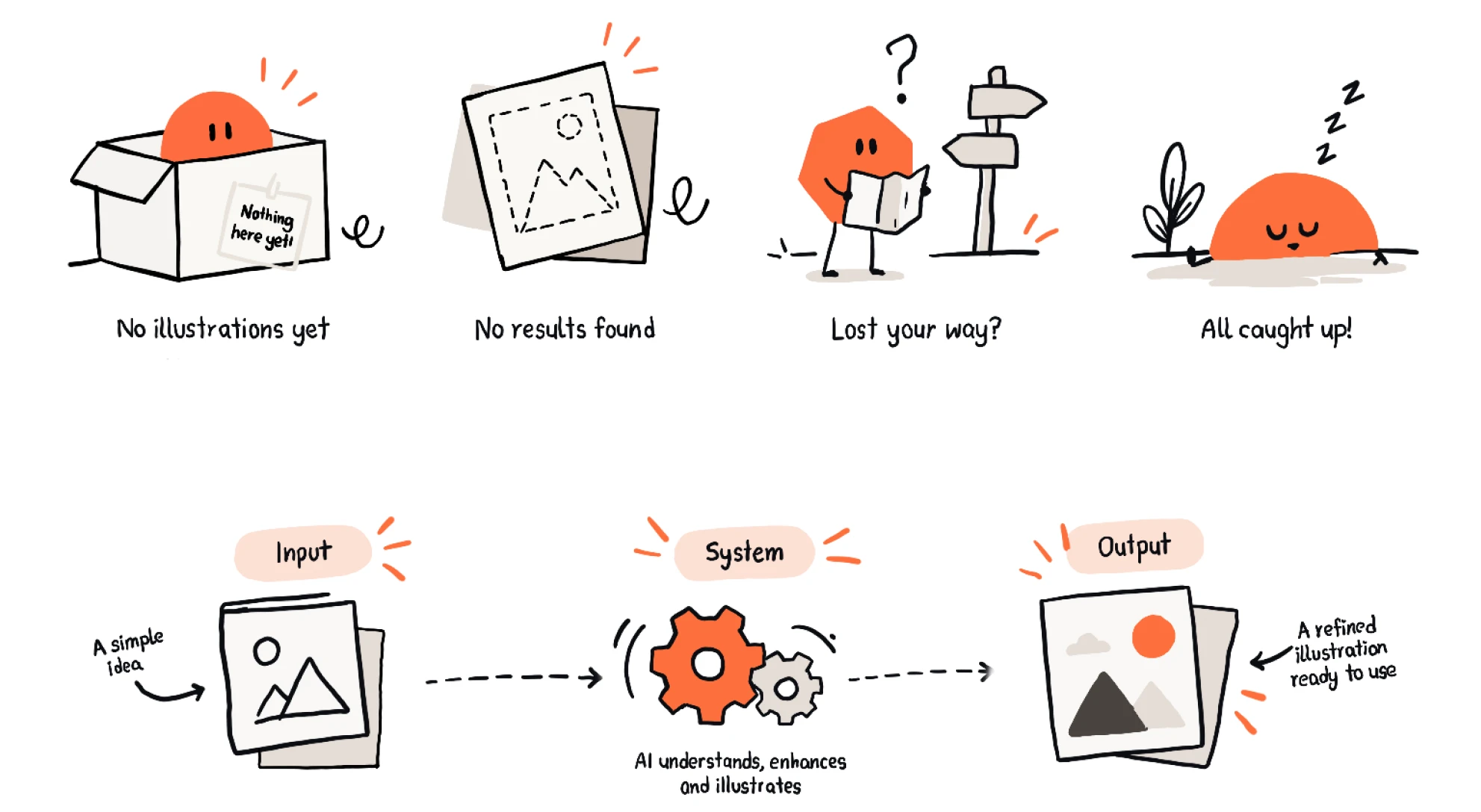
So I stopped treating it as illustration work and started treating it as a systems problem. I built a structure using Codex that generates .lottie animations and illustrations for empty states, on demand, consistent in style, without me hand-drawing each one from scratch. The first time I ran it and got back something genuinely usable, not perfect, but usable, in under a minute, I remember just staring at the screen for a second. That was a task that used to take an afternoon.

Four empty-state illustrations (no illustrations yet, no results found, lost your way, all caught up) above a flow where a simple idea goes through an AI system and comes out as a refined illustration.

The plugin that skipped a whole job title

Hackathon project, built in a weekend, solving a problem most teams just quietly live with.

Every team with a design system eventually hits the same wall: the components look right in Figma, and then someone has to manually rebuild each one in Storybook, by hand, matching every state, every prop, every variant, one component at a time. It's not hard work. It's just relentless, repetitive, and the kind of task that makes a good engineer's soul quietly leave their body.

Batman and I, no wait, it was me and a hackathon teammate, looked at this and asked the obvious question: why is a human doing this at all? The mapping between a Figma component and its code equivalent isn't creative work, it's translation work, and translation is exactly the kind of thing that shouldn't need a person doing it manually every single time.

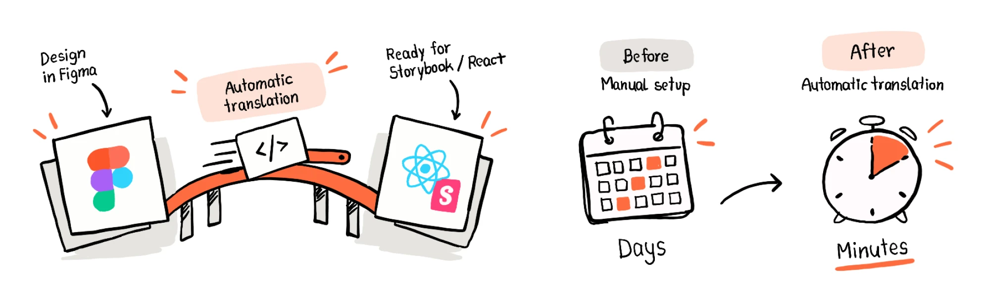
So we built a plugin that does the translation automatically. Feed it a Figma component, get back a working Storybook entry, React component, states and properties intact. What used to be a multi-day task for a developer became something that happened while we were getting coffee.

A bridge carrying a component from Figma to Storybook and React through automatic translation, next to a calendar of days turning into a stopwatch of minutes.

Keeping everyone in the same room, on purpose

Here's something nobody tells you about design teams: the work doesn't fall apart because people can't design. It falls apart because people stop talking to each other, quietly, over weeks, until decisions are being made in silos and nobody notices until it's expensive to fix.

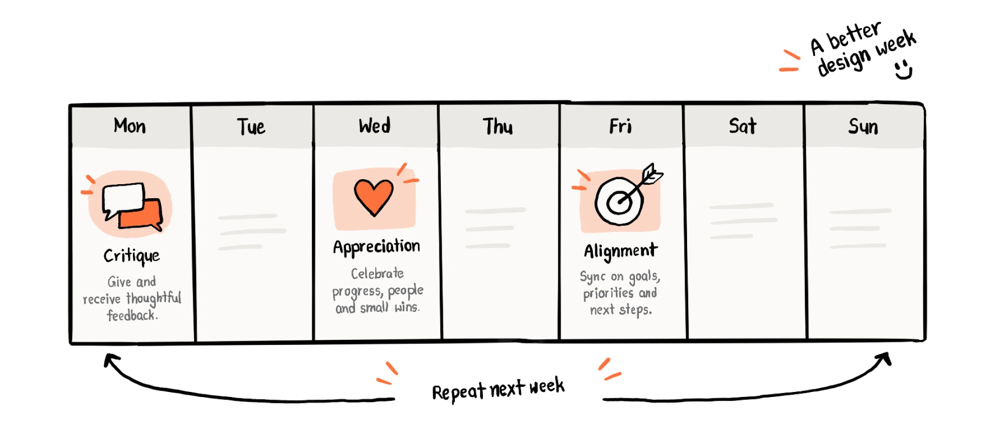
I didn't want to find that out the hard way. So I set up weekly design discussions, and I was deliberate about what each one was actually for, because "let's all get on a call" is not a strategy. Critique sessions, where the work got challenged, properly, not politely. Appreciation rounds, because teams that only ever hear what's wrong start to burn out, and good work deserves to be said out loud. Alignment syncs with founders and stakeholders, so a design decision got tested against the business reality before it shipped, not discovered to be wrong three sprints later.

It's the least glamorous thing on this entire page. It's also probably the reason everything else on this page was possible. Systems and tools don't build themselves, rooms where people actually talk to each other do.

A weekly calendar with critique on Monday, appreciation on Wednesday and alignment on Friday, repeating every week.

Writing down the "why," not just the "what"

Every team accumulates a graveyard of decisions nobody remembers making. Six months in, someone asks "why does this flow work this way, it seems weird," and the honest answer, more often than anyone wants to admit, is a shrug and a "I think that's just how it's always been."

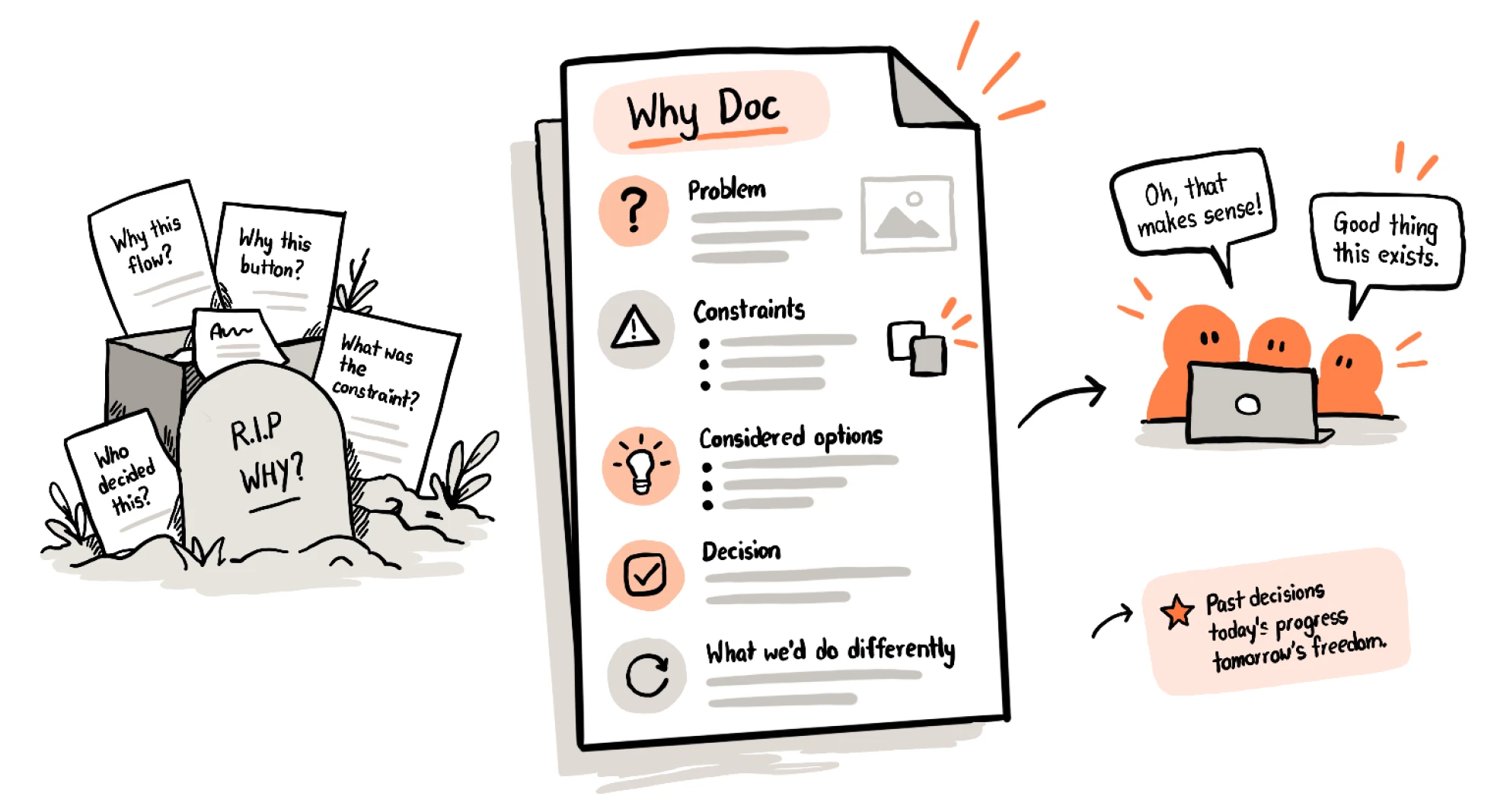
That shrug used to bother me. Somewhere behind every "weird" decision was a real constraint, a real trade-off, a real reason, it just never got written down, so it evaporated the moment the person who made it moved on to the next thing. I started documenting every design solution as it happened, not the polished outcome, the actual reasoning. What we considered. What we ruled out and why. What we'd do differently if the constraint changed.

It sounds like busywork until the day someone's about to repeat a mistake the documentation already warned them about. That's the day it earns its keep.

Forgotten decisions in a graveyard turn into a Why Doc covering problem, constraints, considered options, decision and what we would do differently, which makes the team say "Oh, that makes sense!"

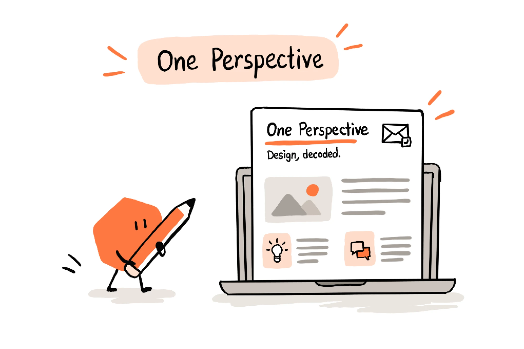
One Perspective

The newsletter I started because I was tired of design being a black box to everyone else.

Here's a conversation that happens at every company with a design team: someone from another department asks "why did this take so long, it's just moving a button," and the designer in the room has to decide whether it's worth the twenty minutes to actually explain it, or whether to just smile and move on. Most days, people smile and move on. The gap never closes.

I got tired of that gap. So I started One Perspective, a newsletter with a simple, slightly stubborn goal: make design legible to people who don't do design for a living, and in the process, raise the bar for the kind of feedback design actually gets. Not "I don't like the blue," but feedback grounded in something real.

It wasn't an instant hit. The first issue got a handful of polite replies. But it kept going, and slowly it became one of the only channels at the company where design spoke to everyone, not just to itself in a Figma comment thread nobody else could see.

A pencil character presenting the One Perspective newsletter, "Design, decoded", on a laptop.