Figure and Ground
How we separate objects from their backgrounds, and what happens when designers blur the line.
Figure and Ground
A vase that keeps turning into faces
Most of us have seen the picture at some point, maybe in a school textbook or a quiz at the back of a magazine. In the middle is a white shape that looks like a vase or a goblet. Look again, and the white disappears into the background, and you see two dark faces in profile, nose to nose, looking at each other. You can switch between the two readings, sometimes at will and sometimes without meaning to, but you can't quite see both at the same moment. Whichever one you're looking at becomes the object, and the other becomes empty space behind it.
The image is known as Rubin's vase, after the Danish psychologist Edgar Rubin, who studied this kind of ambiguous picture in his doctoral research, published in 1915. He was interested in a question that sounds almost too simple to need asking: how do we decide which part of an image is a thing and which part is the background? Rubin called these two parts the figure and the ground. His work showed that our brains are constantly making this split, automatically and very quickly, every time we look at anything. Usually we never notice it, because the answer is obvious. Ambiguous images like the vase are interesting because they make the process visible. For designers, understanding figure and ground is essential, because almost every design depends on people instantly seeing the right thing as the figure.
What makes something the figure
Rubin and the researchers who followed him noticed that the figure and the ground feel different in some consistent ways. The figure seems to have a shape and an outline that belong to it, while the ground seems to continue behind it, as if it carries on underneath. The figure feels closer to us and more solid, like an object. The ground feels further away and less defined, like a backdrop. We also tend to remember the figure and forget the ground. Ask someone to describe a photo of a cup on a table, and they'll describe the cup in detail and barely mention the table.
Over the years, psychologists have identified several clues our brains use to decide which is which. Smaller areas tend to be seen as figure and larger areas as ground. Enclosed shapes tend to be seen as figure, especially if they're surrounded on all sides. Shapes that bulge outwards, called convex shapes, are more often seen as objects than shapes that curve inwards. Symmetrical shapes are more likely to be seen as figure than irregular ones. And in a study published in 2002, the psychologists Shaun Vecera, Edward Vogel and Geoffrey Woodman found that people tend to see the lower part of an image as the figure, which makes sense in a world where objects usually sit on the ground with sky above them.
These clues matter because designers can use them deliberately. If you want something to stand out clearly as an object, make it smaller than its surroundings, give it a clean, closed outline, place it where the eye expects objects to be and give it strong contrast with what's behind it. If you want something to recede into the background, make it larger, softer, more open and lower in contrast. Most of the time, good design uses these clues to make the figure completely unambiguous. Occasionally, as we'll see next, it bends them on purpose.
When designers let the figure and ground swap places
Some artists have built entire bodies of work around blurring figure and ground. The Dutch artist M. C. Escher is the most famous example. In his 1938 woodcut Sky and Water I, the top of the picture shows a flock of dark birds flying against a pale sky. As your eye moves down, the birds become less detailed and the pale spaces between them gradually take on the shapes of fish, until at the bottom you're looking at pale fish swimming against dark water. In the middle band, the birds and the fish fit together perfectly, each one forming the background for the other. You can't say which is the figure, because both are, depending on where you look. Escher spent years working out how to make shapes interlock like this, and the results still feel like magic.
Graphic designers often use the same idea in a quieter way. The WWF panda logo is a well-known example. The first version was drawn in 1961 by the naturalist and artist Peter Scott, inspired by a giant panda called Chi Chi who lived at London Zoo. Later versions, including a major redesign in 1986, simplified it so that the panda is built mostly from a few black shapes, the eyes, ears, legs and parts of the body. There's no outline around the white parts of the panda at all. Its head and back are formed by the white background, which our eyes fill in to complete the animal. The white space is doing the work of the figure.
This is closely related to the idea of negative space from the post on shape, and to the Gestalt principle of closure, where the eye completes shapes that aren't fully drawn, which I'll cover later in the series. Used well, a figure-ground play like this makes a design memorable, because the viewer has to take part in completing it. It feels a little like being let in on a secret. Used carelessly, it just makes a design hard to read.
Nature and war: the art of not being the figure
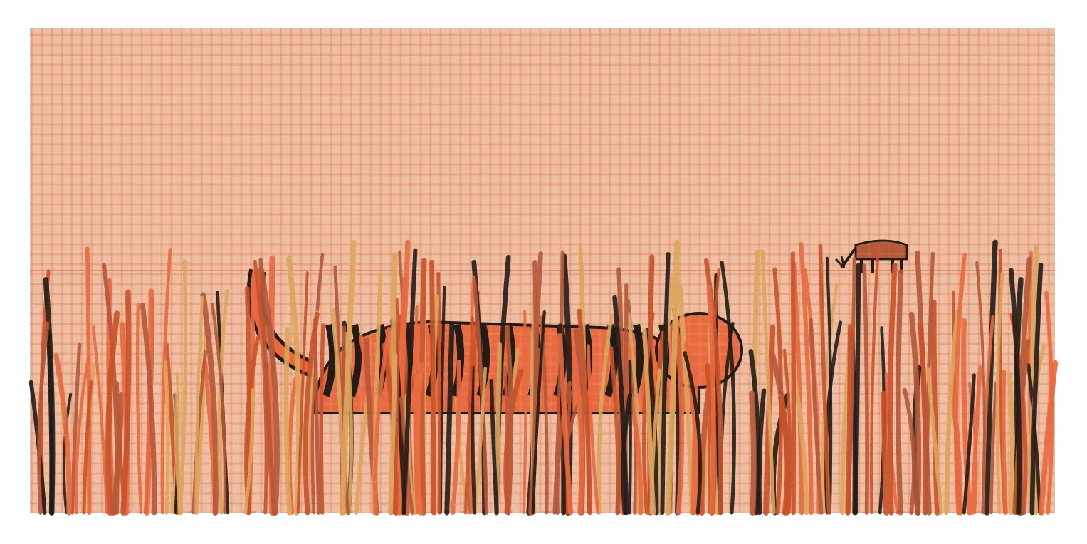
If design usually tries to make the figure obvious, camouflage does the opposite. Its whole purpose is to stop something being seen as a figure at all. A tiger in the tall grass of an Indian forest is a good example. To us, a tiger looks bright orange and almost impossible to miss. But its dark vertical stripes break up its outline, so its body doesn't form one clean, closed shape against the background. It looks more like scattered patches of light and shadow among the stems of grass. There's another twist. Research led by scientists at the University of Bristol, published in 2019, pointed out that deer, a tiger's main prey, see colour differently from humans, and to their eyes, the tiger's orange probably looks much closer to green. To a deer, the striped tiger may blend almost perfectly into the vegetation. The tiger is designed, by evolution, to refuse to become the figure.
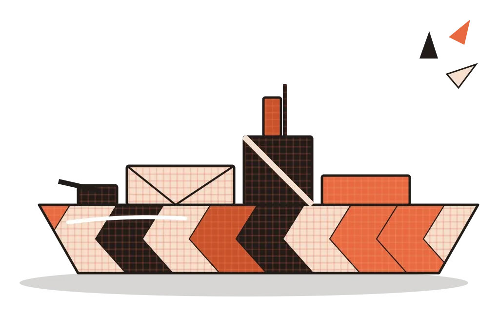
During the First World War, people tried to use a similar trick on a much bigger scale, though with a surprising twist. In 1917, the British artist Norman Wilkinson proposed painting warships in bold, clashing patterns of stripes, zigzags and curves in contrasting colours. The idea, which became known as dazzle camouflage, wasn't to make ships invisible. On the open sea, that was impossible. Instead, the patterns were meant to confuse enemy submarine crews looking through periscopes, making it hard for them to judge a ship's shape, direction and speed, so their torpedoes would miss. Thousands of ships were painted this way. Whether it actually worked is still debated by historians, but the ships themselves looked extraordinary, and the patterns later inspired artists and fashion designers.
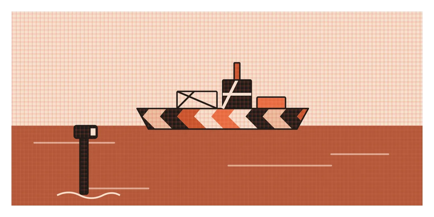
Both examples are useful for designers because they show the principles working in reverse. A broken outline, low contrast with the surroundings and patterns that cross the edges of an object all weaken the figure. That's exactly what you want to avoid when you need something to be seen, like a button, a warning or a road sign, and exactly what you might use when you want something to sit quietly in the background.
Figure and ground on a screen
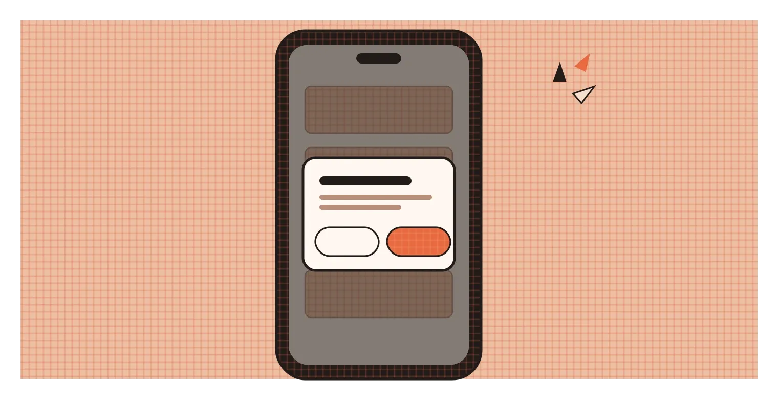
Interfaces are full of figure-ground decisions, most of which happen so smoothly that nobody notices them. One of the clearest is the pop-up dialog. When an app asks you to confirm a deletion or log in, the dialog box appears in the middle of the screen, and everything behind it is dimmed with a semi-transparent dark layer, often called a scrim. That dimming does exactly what Rubin described. It pushes the rest of the app back into the ground and makes the dialog the unmistakable figure. Your eyes and attention go straight to it, and it's clear you need to deal with it before anything else.
Cards, menus and floating buttons work in a similar way. A card with a slightly different background colour and a soft shadow reads as an object sitting on top of the page. A dropdown menu that appears with a shadow beneath it feels like it's floating above the content, so you know it's temporary. As I mentioned in the post on form, Google's Material Design built a whole system around this, using shadows and layers to show which elements are in front of others. All of it is figure and ground, made explicit.
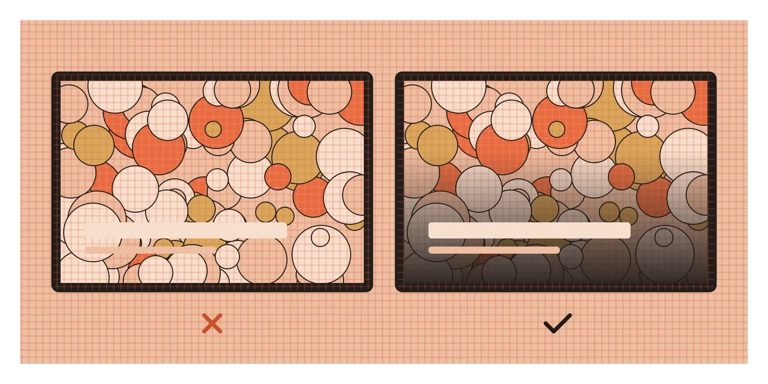
One of the most common failures happens with text placed over photographs. A headline that looks fine over one part of an image can become almost unreadable where the photo gets busy or changes brightness, because the text stops standing out as a figure and starts mixing into the ground. Designers usually solve this by adding a subtle dark gradient behind the text, blurring or darkening the image, or placing the text on a solid band of colour. Each fix does the same thing: it simplifies the ground so the figure can stand clearly on top of it. It sounds like a small detail, but on a busy website or app, it's often the difference between a headline people read and one they skip.
Make the figure obvious, unless you have a reason not to
Figure and ground might be the most basic decision our eyes make. Before we notice colour, read a word or recognise a face, we've already split the scene into things and the space behind them. Most of the time, designers want that split to happen instantly and correctly, so that people see the button, the headline or the product without effort. Occasionally, an artist or designer blurs it on purpose, like Escher's birds and fish or the panda built from empty space, to make people look twice and take part in completing the image. And sometimes, as with camouflage, the whole goal is to avoid becoming a figure at all.
The practical habit I'd take from this is to check your designs for figure-ground clarity early and often. Look at each screen or layout and ask: what is the figure here, and is it obvious? If the answer isn't clear within a second or two, try the clues from Rubin's work. Make the important element smaller and more enclosed relative to its surroundings, give it a clean edge, increase its contrast with the background, and simplify whatever sits behind it. Be especially careful with text over images, busy backgrounds and subtle low-contrast styles, which are the most common places for figure and ground to get tangled.
Rubin's vase has been flipping back and forth in people's minds for more than a century, and it still works every time. It's a reminder that what we see isn't simply what's in front of us. It's what our brains decide to treat as important. Good design makes that decision easy, so that the right thing steps forward and everything else quietly becomes the ground.
Further reading: Edgar Rubin, Synsoplevede Figurer (Visually Experienced Figures, 1915) · Shaun Vecera, Edward Vogel and Geoffrey Woodman, "Lower region: A new cue for figure-ground assignment" (2002) · Rudolf Arnheim, Art and Visual Perception (1954)