Texture
How surfaces speak to our hands and eyes, even on a screen you can't touch.
Texture
A teacup covered in fur
In 1936, the Swiss artist Meret Oppenheim covered an ordinary teacup, saucer and spoon in the fur of a Chinese gazelle. The story goes that she had been at a café in Paris with Pablo Picasso and the photographer Dora Maar, and when Picasso admired a fur-covered bracelet she was wearing, he joked that you could cover anything in fur. She took the joke seriously. The piece, simply titled Object, was bought by the Museum of Modern Art in New York the same year and has been unsettling people ever since.
What makes it so strange is not its shape. It's still clearly a teacup. It's the texture. A cup is supposed to feel smooth, hard and cool against your lips, and fur is soft, warm and slightly ticklish, the last thing you'd want in your mouth with hot tea. Most people who see it can almost feel it, and many of them wince. That reaction says something important. We don't just look at surfaces, we imagine touching them, and that imagined touch changes how we feel about an object before we've laid a finger on it. In design, that quality of a surface is called texture, and it's one of the most physical, instinctive elements we work with.
Two kinds of texture
Texture is the quality of a surface: whether it feels, or looks like it would feel, rough or smooth, soft or hard, grainy, glossy, bumpy or slick. Designers usually split it into two kinds. Actual texture, sometimes called tactile texture, is the real physical surface you can touch, like the weave of a cotton shirt, the grain of a wooden table, the slight roughness of handmade paper or the cool smoothness of glass. Visual texture, sometimes called implied texture, is the illusion of a surface on something that is actually flat. A photograph of tree bark on a phone screen has visual texture. So does a painting of velvet, a pattern of dots on a poster, or an illustration with a grain effect added on top.
The two are connected by our imagination. When we see a convincing visual texture, part of our brain responds as if we might touch it, which is why a photo of crumpled paper can look "warm" and a photo of brushed steel can look "cold" even though both are just pixels. That's also why Oppenheim's teacup works. You never have to touch it. Your eyes deliver the texture, and your imagination supplies the uncomfortable feeling.
Texture also does something very practical: it adds information and interest to a surface. A large area of flat, uniform colour can feel empty or lifeless, especially in print or on packaging. Add a subtle texture and the same area suddenly has depth and character. Too much texture, though, quickly becomes noise. A busy pattern behind text can make the text hard to read, and a surface covered in competing textures can feel chaotic. Like most elements, texture is most powerful when it's chosen on purpose and used in the right amount.
Texture you can feel carries meaning too
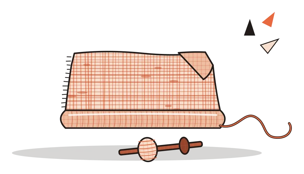
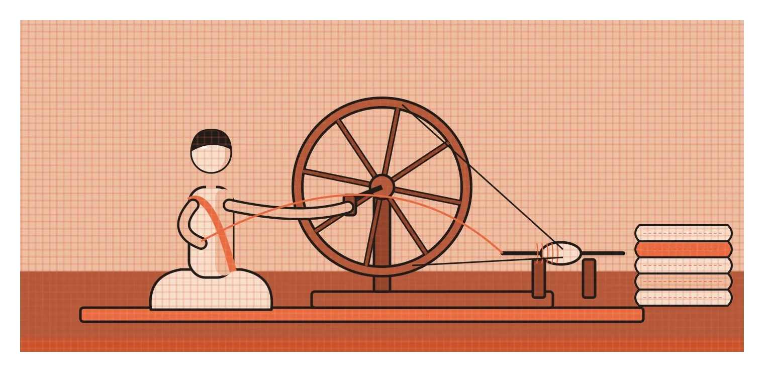
In India, one of the most meaningful textures is khadi, cloth that is spun and woven by hand. Because the thread is hand-spun, it's never perfectly even. Small thicker and thinner patches, called slubs, run through the fabric and give it a slightly rough, irregular surface that machine-made cloth doesn't have. In the 1920s, Mahatma Gandhi made khadi a symbol of the independence movement, urging Indians to spin and wear their own cloth instead of buying mill-made fabric from Britain. The texture became part of the message. The unevenness wasn't a flaw to be hidden. It was proof that a person had made it by hand, and wearing it was a public statement about self-reliance. It's a good example of how a texture can carry history, values and identity, not just a feeling under your fingertips.
Texture can also carry very practical information. In 1965, a Japanese inventor named Seiichi Miyake developed raised paving tiles to help a friend who was losing his sight, and the first ones were installed near a school for the blind in Okayama in 1967. Today, tactile paving is used in many countries, including along metro stations and some footpaths in Indian cities. The basic language is simple. Long raised bars running in one direction mean "follow this path", and a grid of raised dots means "stop, there's a hazard or a change ahead", such as a platform edge or a road crossing. People who are blind or have low vision can read these textures through their feet or a cane.
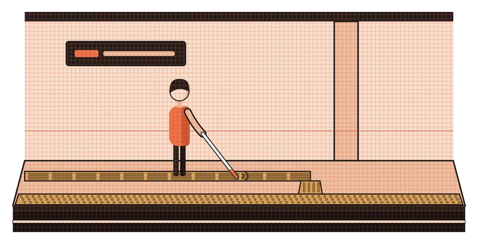
That language only works if it's used carefully, though. News reports and photographs from several Indian cities have shown tactile paths that lead straight into poles, trees, broken slabs or open drains, often because they were laid as a box to tick rather than as a route someone would actually walk. A texture that's meant to guide someone safely can become dangerous if the design behind it isn't thought through. It's a sobering reminder that texture isn't always about style. Sometimes it's how someone finds their way.
Texture you can only see
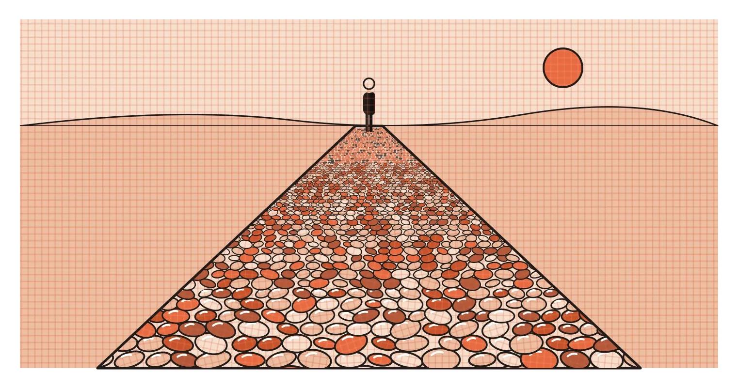
Visual texture is one of the ways our eyes judge distance. In 1950, the American psychologist James J. Gibson described what he called the texture gradient. Look across a pebbled beach, a field of grass or a tiled floor, and the texture looks coarse and detailed close to you and becomes finer and denser as it stretches away. Your brain uses that change to work out how far away things are and which way a surface is tilted. Painters and illustrators use the same effect deliberately, drawing large, clear texture in the foreground and smaller, softer texture in the distance, which makes a flat image feel deep.
Artists have also used visual texture to fool the eye completely. There's a long tradition of painting called trompe l'oeil, French for "deceive the eye", in which painters make flat surfaces look like carved stone, folded cloth, wood grain or even insects sitting on the canvas. The skill lies almost entirely in texture: the way light catches the tiny bumps of a surface, the way a fabric's weave shows at its folds. In everyday design, the same techniques show up more quietly. Packaging often uses printed textures, like a paper or linen effect, to make a product feel more natural or premium even when the box itself is smooth card.
On screens, texture goes through fashions. Early smartphone apps were full of realistic textures, leather, wood, felt and paper, which I wrote about in the post on form. Then flat design stripped most of them away. More recently, many websites and illustrations have brought back subtle textures, like a light film-grain effect or a paper-like noise over flat colour. The illustrations on this blog use a version of this: a fine graph-paper grid across each object. It's subtle enough not to compete with the drawing, but it stops large flat areas from feeling empty and gives the whole set a recognisable, slightly hand-made character.
Texture isn't only about touch and sight
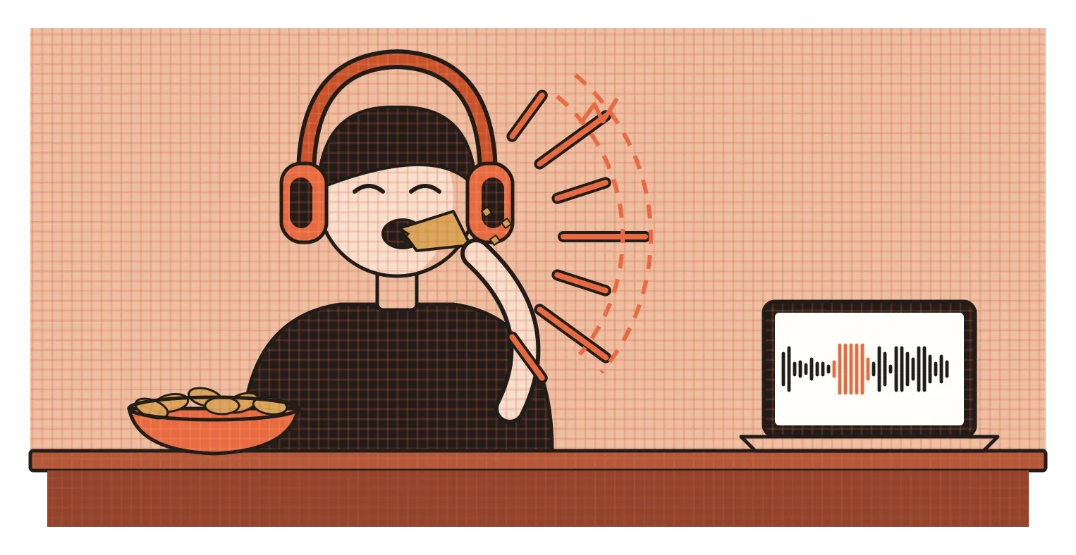
One of my favourite pieces of research about texture involves potato crisps. In 2004, the experimental psychologists Massimiliano Zampini and Charles Spence at the University of Oxford asked people to bite into crisps while wearing headphones. As each person bit down, the sound of their crunch was played back through the headphones, sometimes exactly as it was and sometimes altered, louder or with the high-pitched frequencies boosted or reduced. When the crunch sounded louder and sharper, people rated the same crisps as crisper and fresher. When it was muffled, they rated them as staler. The crisps hadn't changed at all. Only the sound had. The study later won an Ig Nobel Prize, an award for research that first makes people laugh and then makes them think, and it's a great reminder that we judge texture with several senses at once.
Product designers have known this for a long time. The click of a well-made pen, the soft thud of a car door closing, the snap of a phone case fitting into place, all of these sounds tell us something about the quality and solidity of a surface we may not even be touching directly. Some car companies have teams that carefully tune how their doors sound when they close, because a solid, low thud makes the whole car feel better built.
Screens have started to borrow these cues as well. In 2015, Apple introduced a trackpad that doesn't actually move when you press it. Instead, a small motor produces a precise vibration that feels almost exactly like a physical click, and many people use it for years without realising. Phones now use similar haptic feedback, short and carefully shaped vibrations, to give a feeling of texture to things like scrolling through a list, toggling a switch or reaching the end of a page. It's texture without any real surface, designed entirely through timing and vibration, and when it's done well, the interface feels more solid and trustworthy.
Notice how things feel before how they look
Texture is the element that most directly connects design to the body. A shape or a colour can be understood from across the room, but texture invites you to come closer and touch, or at least imagine touching. That's why it carries so much emotional weight. The smoothness of a phone, the roughness of khadi, the bumps of tactile paving and the crunch of a crisp all shape how we feel about something, often more than we realise. And on screens, where there's nothing to touch at all, designers keep finding ways to bring texture back through grain, depth and vibration, because people seem to miss it when it's gone.
The habit I'd take from this is to pay attention to texture deliberately, both in the world and in your own work. When you pick up an object you like, notice what its surface is doing. Is it smooth, matte, soft, cold, warm? When you look at a design that feels flat or lifeless, ask whether a subtle texture would help, and when a design feels busy, check whether too many textures are competing. And whenever texture is carrying information, like a tactile path or a button that needs to feel pressable, test it with the people who rely on it most, because they'll notice problems long before anyone else does.
Oppenheim's furry teacup still makes people flinch almost ninety years later, and it does it with nothing more than a change of surface. That's the quiet power of texture. Change the surface, and you change how people feel about the whole object, sometimes before they've had a chance to think about it at all.
Further reading: James J. Gibson, The Perception of the Visual World (1950) · Massimiliano Zampini and Charles Spence, "The role of auditory cues in modulating the perceived crispness and staleness of potato chips" (2004) · Ellen Lupton and Jennifer Cole Phillips, Graphic Design: The New Basics (2008)