Value
Why lightness and darkness do more work than colour ever gets credit for.
Value
Two squares that are exactly the same grey
In 1995, Edward Adelson, a vision scientist at MIT, published an image that still trips up almost everyone who sees it. It shows a checkerboard of light and dark squares with a green cylinder standing on it, casting a soft shadow across part of the board. Two squares are labelled A and B. Square A, outside the shadow, looks clearly dark. Square B, inside the shadow, looks clearly light. They are, in fact, exactly the same shade of grey. If you cover everything around them, or cut them out and put them side by side, they match perfectly. Even after you know this, it's almost impossible to see them as the same.
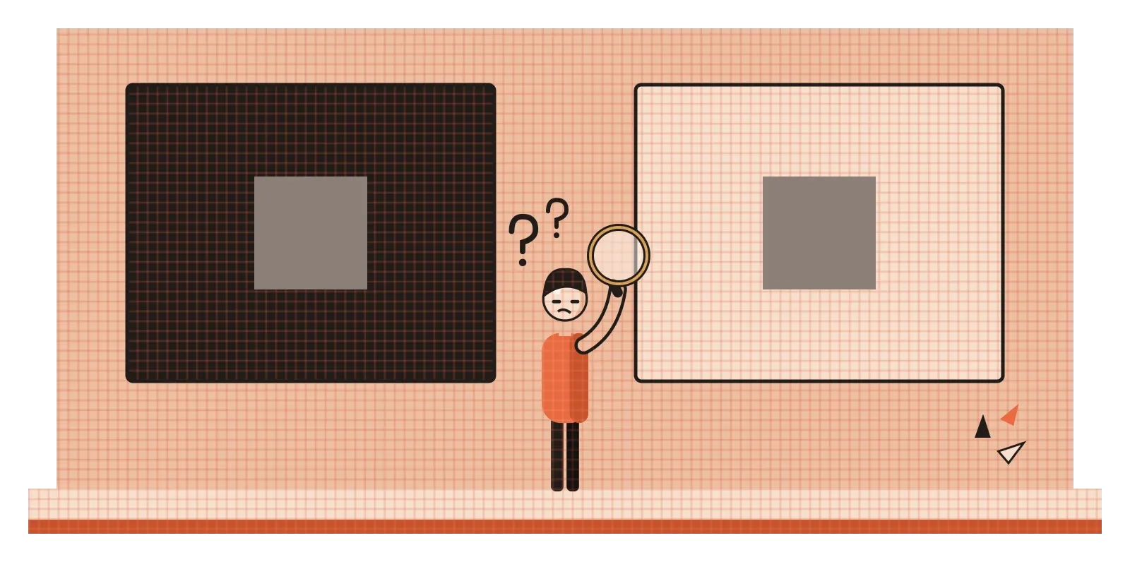
The illusion works because our visual system isn't designed to measure the exact amount of light coming from each patch. It's designed to work out what the surfaces in front of us are really like. Your brain sees that B is in shadow and quietly corrects for it, concluding that it must be a light square that happens to be dimly lit. It's a brilliant shortcut for living in a world full of shadows, and a constant trap for designers. It shows that how light or dark something looks depends heavily on what surrounds it. In design, this lightness or darkness is called value, and once you start paying attention to it, you realise it's doing a huge amount of the work that we usually give colour the credit for.
Light, dark and everything in between
Value simply means how light or dark something is, from pure white at one end to pure black at the other, with every grey in between. Every colour has a value too. A pale yellow is light, a navy blue is dark, and a bright red sits somewhere in the middle. One of the easiest ways to see value on its own is to turn a colour photo into black and white. All the hues disappear, but the picture usually still makes sense, because the lights and darks are doing most of the work of showing shapes, edges and depth.
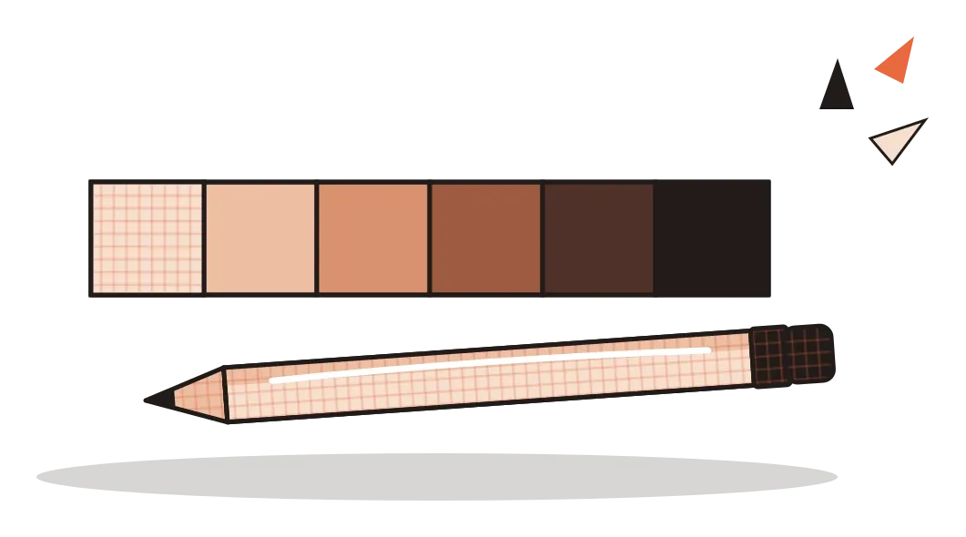
Designers and artists often think about value as a scale with a set number of steps. In the early 1900s, the American painter and teacher Albert Munsell developed a colour system, first published in 1905, that measured value on a scale from 0 for pure black to 10 for pure white. It treated value as one of three separate dimensions of colour, alongside hue and chroma, an idea I'll come back to in the post on colour. A value scale is also one of the first exercises many drawing students do: a row of boxes shaded evenly from white to black with a pencil, which trains the hand and eye to control subtle steps of tone.
There's an older idea from Japan that's useful here. Notan, roughly meaning the harmony of light and dark, describes how a composition is built from the balance of light and dark masses. In 1899, the American artist and teacher Arthur Wesley Dow introduced the idea to Western art education in his book Composition, encouraging students to reduce images to simple patterns of black, white and a few greys before worrying about detail or colour. It's still one of the best ways to check whether a design is working. If the arrangement of light and dark shapes is strong and clear on its own, the colour and detail usually fall into place. If it isn't, no amount of beautiful colour will save it.
Value is how a flat picture becomes solid
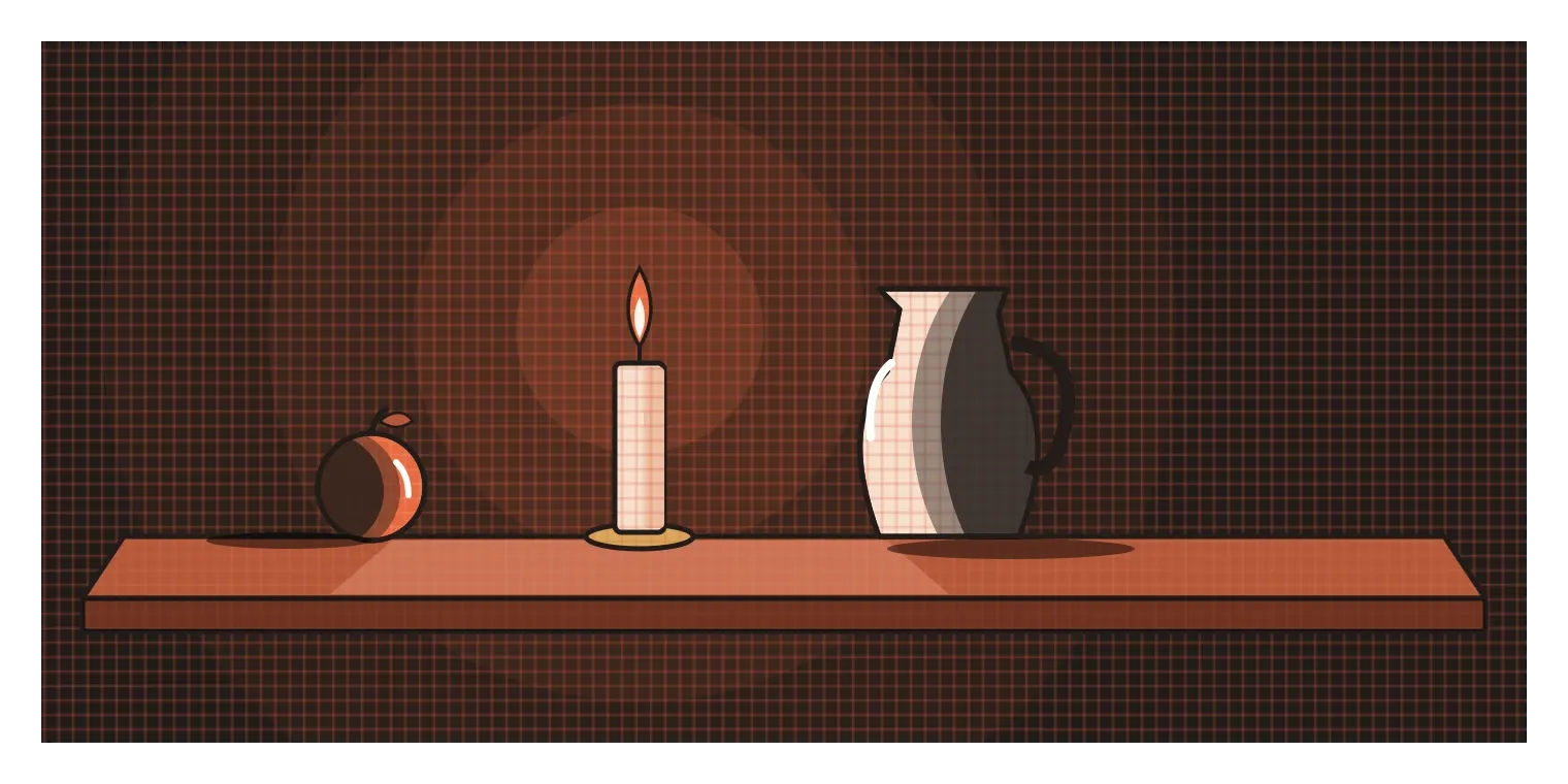
In the post on form, I mentioned that painters create the illusion of three dimensions on flat surfaces using light and shadow. Value is the tool that does it. Shade one side of a circle darker, leave a bright spot on the other, and add a soft shadow underneath, and the circle becomes a ball. Italian Renaissance artists had a word for this modelling with light and dark: chiaroscuro, which literally means light-dark. Leonardo da Vinci used very gentle transitions of value, so soft that edges seem to melt into shadow. A century later, the painter Caravaggio pushed it to an extreme. His figures often seem to emerge from almost total darkness, lit by a single sharp source of light, a dramatic style sometimes called tenebrism. Painters like Rembrandt took the approach further still. In all of these works, the colour is often quite limited. It's the range of values, from bright highlights to deep shadows, that creates the drama and the sense of depth.
India has its own beautiful tradition built on light and dark. In Andhra Pradesh, Tholu Bommalata, which means roughly the dance of leather puppets, is a form of shadow puppetry with roots going back centuries. The puppets are made from thin, translucent animal hide that is cut, perforated and painted in bright colours, and some can be nearly as tall as a person. During a performance, the puppeteers press them against a white cloth screen with a lamp burning behind it, and the audience on the other side sees glowing, coloured silhouettes moving through stories from the Ramayana and the Mahabharata. Holes punched into the leather let points of light shine through, adding pattern and detail.
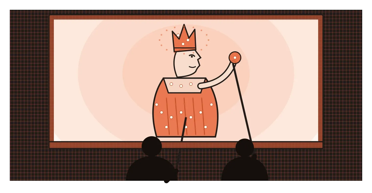
What I find clever about this is how it plays with value. Where the leather is thick or painted dark, little light passes through and the shape reads as solid. Where it's thin, pale or perforated, the light glows. The puppeteer can move a figure closer to the screen to make it sharp and bright, or pull it back to make it softer and larger. The whole performance is a lesson in how a single light source and a careful control of light and dark can create character, depth and atmosphere.
The eye goes to contrast first
In any design, our eyes are pulled most strongly to the places where light and dark meet most sharply. A black headline on a white page grabs attention faster than a pale grey one. A bright button on a dark background stands out more than a mid-toned one. This is why value is one of the main tools for creating hierarchy, the order in which people notice things. The strongest contrast says "look here first", medium contrast says "this is supporting information", and low contrast says "this is in the background, or not available right now". Many interfaces use exactly this pattern, often without anyone describing it in those terms. The main action is the darkest or brightest element, secondary actions are softer, and disabled buttons are faded so they almost blend into the background.
Photographers have thought about value in a very structured way. In the late 1930s and early 1940s, the American landscape photographer Ansel Adams and his colleague Fred Archer developed what they called the Zone System, which divides the range from pure black to pure white into eleven zones. Adams would decide in advance which parts of a scene he wanted to place in which zone, then expose and develop his film to match. It's part of why his black-and-white landscapes have such rich, deep shadows and bright, detailed highlights.
Designers have a much simpler way to check value, and I'd recommend it to anyone. It's called the squint test. Step back from your design, or literally squint at it until the details blur. You'll stop seeing words and small shapes and start seeing just the big patches of light and dark. Ask yourself where your eye lands first, and whether that's the thing that matters most. You can do the same digitally by switching a design to greyscale. If everything ends up the same middle grey, the design probably has no clear hierarchy. If the wrong thing is the darkest or brightest spot, that's what people will notice first, whatever the colours are.
Value decides who can read your design
Value isn't only about drama and hierarchy. It's also about whether people can read what you've made at all. The Web Content Accessibility Guidelines, usually called WCAG, are the international standard most digital products use for accessibility. Since version 2.0 was published in 2008, they have measured text readability using a contrast ratio between the text and its background, calculated from how light or dark each colour is. For normal body text, the common target is a ratio of at least 4.5 to 1, and for large text, at least 3 to 1. In practice, this is almost entirely a measure of value. A pale grey label on a white background might look elegant in a presentation, but for someone with low vision, an older screen, or a phone in bright sunlight, it can be nearly invisible.
Value matters for colour blindness too. Commonly cited estimates suggest that around one in twelve men and one in two hundred women have some form of colour vision deficiency, most often difficulty telling certain reds and greens apart. If a design relies only on hue to show the difference between, say, a success message and an error message, some people won't be able to tell them apart. If the two also differ clearly in value, or come with an icon or a word, they'll still work. This is another reason the greyscale test is so useful. It shows you, roughly, what your design looks like when colour can't be relied on.
Dark mode has made all of this more visible. Turning a light interface dark isn't as simple as swapping black and white. Pure white text on a pure black background can feel harsh and glaring, especially for long reading, so many design systems recommend a very dark grey background and slightly softened white text instead. Google's Material Design guidelines, for example, suggest a dark grey rather than true black for dark themes, partly so that shadows and layers can still be seen. Designing a good dark mode is essentially redesigning the whole value structure of a product, making sure the right things still stand out and the right things still recede when the lights are flipped.

Get the lights and darks right first
If there's one thing I'd want any designer to take from this post, it's that value usually matters more than colour. Colour gets most of the attention in design conversations, the palettes, the brand shades, the debates about which blue to use. But it's value that tells our eyes where shapes begin and end, what's in front and what's behind, what's important and what can be ignored, and whether text can be read at all. Get the values right and a design often works even in black and white. Get them wrong and the most carefully chosen colours won't fix it.
The practical habit is easy to build. Before you finalise any design, look at it in greyscale and do the squint test. Check that the most important element has the strongest contrast, that supporting information steps back, and that text passes basic contrast checks for accessibility. If you're working on a dark mode, go through the same process again from scratch rather than assuming the light version's choices will carry over. And remember Adelson's checkerboard. Because our eyes judge lightness relative to what's around it, the same grey can look very different in different places, so always check values in context, not in isolation.
Adelson's two squares look completely different even though they're identical, because our brains are constantly reading light and shadow to make sense of the world. That instinct is exactly what designers work with. Used well, value guides people through a design so smoothly that they never notice it happening. Used carelessly, it can hide the most important thing on the screen in plain sight.
Further reading: Edward H. Adelson, "Checker Shadow Illusion" (1995) · Albert H. Munsell, A Color Notation (1905) · Arthur Wesley Dow, Composition (1899) · W3C, Web Content Accessibility Guidelines (WCAG) 2.0 (2008)