Space
Why the empty parts of a design do as much work as the full ones.
Space
The useful part of a bowl is the empty part
More than two thousand years ago, a short Chinese text called the Tao Te Ching, traditionally credited to the philosopher Lao Tzu, made an observation that designers still quote. It points out that thirty spokes meet at the hub of a wheel, but it's the empty hole in the middle that lets the wheel turn. Clay is shaped into a pot, but it's the hollow inside that makes the pot useful. Doors and windows are cut into the walls of a room, and it's the openings that make the room something you can live in. The text's conclusion is that what is there gives us something to work with, but what isn't there is what we actually use.
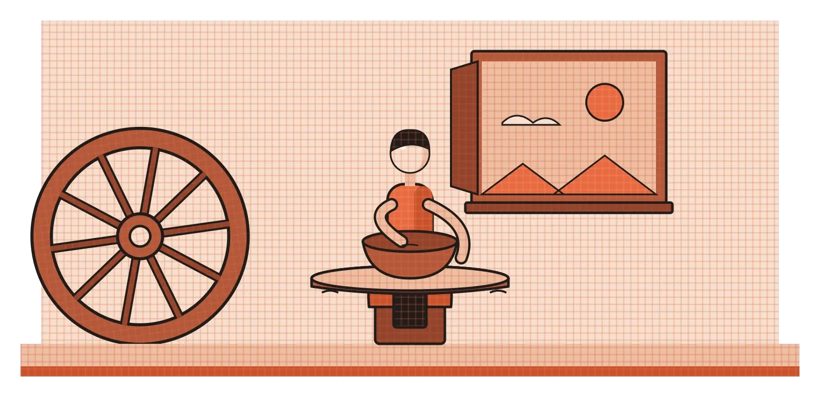
I like starting here because it flips the way most of us think about design. When we learn to design, we focus on the things we add: the shapes, the images, the text, the buttons. Space feels like what's left over after the real work is done. But the bowl, the wheel and the room all make the same point. The empty part isn't leftover. It's often the whole reason the thing exists. In the last post, I wrote about form, the solid three-dimensional mass of an object. This post is about everything around it and inside it, the space that gives form something to sit in, and the space on a page or screen that gives our eyes room to breathe.
Three kinds of space
Designers usually talk about space in three ways. Positive space is the area taken up by the things you've put into a design: the photo, the headline, the chair in a room. Negative space is everything around and between those things. In the post on shape, I wrote about how negative space can form shapes of its own, like the hidden arrow in a famous logo. Here I want to think about it more broadly, as the room that surrounds the elements and decides how they relate to each other. Two buttons placed close together seem connected. Move them apart, and they start to feel like separate decisions. Nothing about the buttons changed, only the space between them.
The third kind is implied space, the sense of depth or room that a flat image creates. A photograph of a long road disappearing towards the horizon feels deep, even though the paper or screen is perfectly flat. A layout with lots of empty margin around a single object can feel open and airy, almost like a quiet room, while a page packed edge to edge feels crowded, like a busy market. Our brains constantly read space into flat surfaces, and designers can use that tendency on purpose.
Space also sets the pace of a design. Think about how a good book page is laid out. The generous margins don't contain any information, yet they make the text feel calm and easy to read, and they give your thumbs somewhere to hold the book without covering words. The spacing between lines, called leading, controls how comfortably your eye moves from the end of one line to the start of the next. The gap between paragraphs tells you when a new thought begins. Remove all of that space and every individual word would still be there, but the page would become exhausting to read. Space is how a design breathes, and like breathing, you only really notice it when it goes wrong.
Making a flat surface feel deep
Creating the illusion of space on a flat surface is one of the oldest problems in art. The best-known breakthrough happened in Florence in the early 1400s, when the architect Filippo Brunelleschi carried out a famous demonstration. He painted a small panel of the city's Baptistery using carefully worked-out lines that all met at a single point on the horizon, then drilled a hole through it. A viewer would look through the hole from the back, at a mirror held in front of the panel, and compare the reflected painting with the real building. The two lined up so convincingly that people were astonished. A few years later, in 1435, the writer and architect Leon Battista Alberti described the method in his book On Painting, and linear perspective, the system of converging lines that makes things shrink as they get further away, became a core skill for European artists.
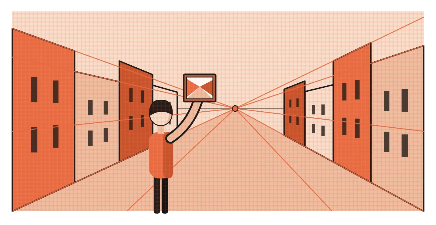
Linear perspective is only one way to create depth, though, and designers use several others every day, often without naming them. When one object overlaps another, we read the one in front as closer. Smaller things tend to look further away than larger ones. Objects placed higher up in a picture often seem more distant, which is why the horizon usually sits near the top of a landscape. Distant things also tend to look paler, softer and slightly bluer, an effect Leonardo da Vinci wrote about and which is now called atmospheric perspective. Shadows and lighting, which I'll cover in the post on value, add even more depth.
Not every tradition chose to use these tricks. In the post on visual literacy, I wrote about how Indian miniature paintings often show buildings from the front and above at the same time, and make important people larger regardless of where they stand. Those artists understood space perfectly well. They simply had different priorities, like telling a whole story in one image or showing who mattered most. That's a useful reminder for designers too. Creating realistic depth is a choice, and sometimes a flatter, more diagrammatic use of space communicates more clearly, the way Harry Beck's Underground map did.
Empty space sends a message
On a page or screen, designers often call negative space white space, even when it isn't white. It's one of the most misunderstood tools in design, partly because clients sometimes see it as wasted room that could be filled with more content. But white space changes how people read and how they feel. A product photo surrounded by lots of empty space looks more precious than the same photo squeezed into a crowded grid. A headline with room around it looks more important than one jammed against the text below. Space works as a kind of spotlight. Whatever it surrounds, it points to.
There's research suggesting this goes beyond individual taste. In 2006, the marketing researchers John Pracejus, Douglas Olsen and Thomas O'Guinn published a study in the Journal of Consumer Research that looked at how advertisers used white space across the twentieth century. They found that it had become much more common over time, and that people tended to read lots of empty space in an ad as a sign of prestige, quality and confidence, almost as if the brand could afford to waste expensive paper. That's partly why luxury brands so often use spare layouts with a single object and very little text. The emptiness itself is part of what's being sold.
It's worth being careful not to treat this as a universal law, though. Plenty of very successful designs around the world are dense. Indian newspapers, shop signboards in busy markets, festival posters and many popular shopping apps across Asia pack in a lot of information, and for many readers that density feels lively, generous and trustworthy rather than cluttered. A spare, minimal layout can feel cold or even suspicious to someone who expects to see all the options and prices up front. The real skill isn't always adding more white space. It's using space deliberately, so that even a busy layout has clear groups, breathing room in the right places and an obvious path for the eye to follow.
Space can be a journey, not just a gap
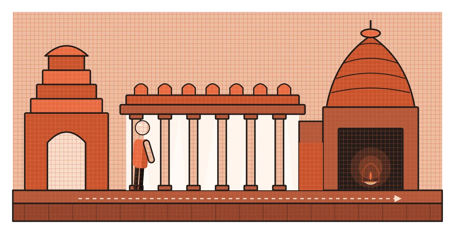
In architecture, space is something you move through, and the order in which you experience it shapes how you feel. Many traditional Hindu temples are built around exactly this idea. You often pass through a gateway into an open courtyard, then into one or more pillared halls called mandapas, where light filters in between the columns. As you move further in, the spaces generally become smaller, darker and more enclosed, until you reach the garbhagriha, a small, dim inner chamber whose name means womb-house, where the main deity sits. The architecture is guiding you from the busy, bright outside world into a quieter and more focused state of mind. You don't just see the space. You go on a journey through it.
Digital products have a version of this too. Every interface is a sequence of spaces, screens, panels and steps that people move through, and how much room each part gets tells them what matters. I learned this very directly while working on an agentic AI system at Rocketium. In our first version, the conversation with the AI and the output it produced sat side by side, but the conversation side was crowded with long streams of the AI's processing text. That crowded space pulled people's attention to the wrong place. Designers read the wall of text, felt overwhelmed and clicked through without properly reviewing the actual output, which was the thing that mattered. In the second version, one of the biggest changes was to move the AI's activity out of the conversation and give the output its own space, with the chat kept as light as possible. Some workflows even opened straight into the output with the chat closed until it was needed.
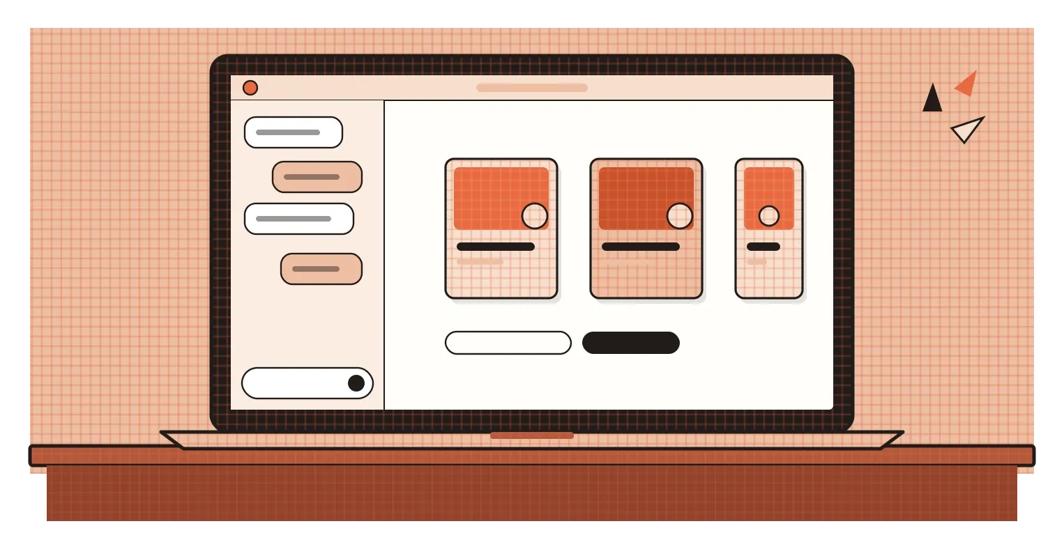
Looking back, that was really a decision about space. We weren't adding new features. We were changing what got room and what didn't, so that the most important thing on the screen also had the most space to breathe. It's the same principle as the temple's inner chamber, just with much lower stakes: give the thing that matters most a clear, uncluttered place, and make the path towards it calm.
Design the gaps on purpose
Space is the element that's easiest to forget, because it isn't really a thing. You can't select it, colour it or drag it around the way you can a shape or a photo. But it decides how everything else in a design is read. It groups and separates, slows the eye down or speeds it up, makes one element look important and another look secondary, and creates depth on a surface that has none. It even carries cultural meaning, signalling luxury in one context and emptiness in another.
The habit I'd take from this is to treat space as something you design, not something you're left with. When a layout feels wrong, before adding or removing any element, try changing only the spacing. Pull related things closer together and push unrelated things further apart. Give the most important element more room than anything else around it. Check whether the gaps between elements follow a consistent rhythm or whether they're just whatever happened while you were working. Many design systems use a fixed set of spacing values for exactly this reason, so that space stays consistent and intentional across an entire product. More often than you'd expect, the design starts working without a single element changing.
The Tao Te Ching talks about wheels, pots and rooms, but its point fits a phone screen or a poster just as well. What's there gives us something to work with. What isn't there is what makes it usable. A bowl is only useful because of its hollow, and a design is often only readable because of its gaps. The empty part is still part of the design. It might even be the most important part.
Further reading: Lao Tzu, Tao Te Ching, chapter 11 · Leon Battista Alberti, On Painting (1435) · John Pracejus, Douglas Olsen and Thomas O'Guinn, "How Nothing Became Something: White Space, Rhetoric, History, and Meaning" (2006)