Shape
Why the outlines we draw carry meaning, and why the space around them matters just as much.
Shape
Which one is called Bouba?
Here's a small test. Imagine two shapes side by side. One is a spiky, star-like shape with sharp points sticking out in every direction. The other is a soft, rounded blob, like a cloud or a splash of paint. One of them is called Bouba and the other is called Kiki. Which is which? If you're like most people, you didn't have to think very hard. The spiky one is Kiki and the round one is Bouba.
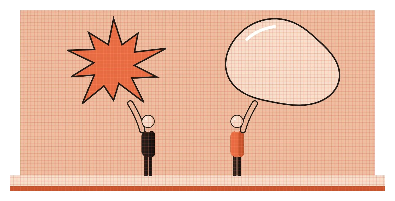
The German psychologist Wolfgang Köhler first ran a version of this experiment in 1929, using the made-up words "takete" and "maluma". In 2001, the neuroscientists V. S. Ramachandran and Edward Hubbard repeated it with the words bouba and kiki and found that roughly 95 percent of people matched them the same way. Later studies have found similar results across many languages and cultures, with some variation. Nobody taught us this rule. The sharp sounds of "kiki" seem to match sharp edges, and the rounded sounds of "bouba" seem to match soft curves, as if our brains connect shape, sound and feeling without asking permission. For designers, it's a lovely reminder that shapes are never just outlines. Before anyone reads a word or recognises an object, the shape alone has already started telling them something.
Lines that close in on themselves
In the last two posts, I wrote about the point, which holds a position, and the line, which is a point in motion. A shape is what you get when a line comes back to meet itself and encloses an area. It has width and height but no depth, which is what separates it from form, the three-dimensional version that I'll cover in the next post. A shape doesn't always need an outline, though. A patch of colour, a silhouette, a shadow or a block of text can all read as shapes, because our eyes see the boundary where one area ends and another begins.
Designers usually sort shapes into two broad families. Geometric shapes are the regular, measurable ones: circles, squares, triangles, rectangles and their relatives. They feel precise, orderly and made by people, partly because they rarely appear perfectly in nature. Organic shapes are irregular and free-flowing, like leaves, pebbles, clouds, puddles or the outline of an animal. They tend to feel natural, soft and alive. Most designs mix the two, and the balance between them sets the tone. A banking app built only from crisp rectangles feels efficient and serious, while a children's brand built from blobby, irregular shapes feels playful and warm.
The Bauhaus took geometric shapes very seriously, sometimes a little too seriously. In 1923, Wassily Kandinsky circulated a questionnaire asking people to fill a triangle, a square and a circle with the colour each one seemed to call for, choosing from yellow, red and blue. Kandinsky's own answer was a yellow triangle, a red square and a blue circle, and he believed there was a universal link between basic shapes and basic colours. Later researchers have found little evidence that people agree on this the way he hoped, and the questionnaire is now remembered more as a piece of Bauhaus history than as science. But the impulse behind it, the feeling that shapes have personalities, is one most designers would recognise.
A shape can tell you to stop before you read a word
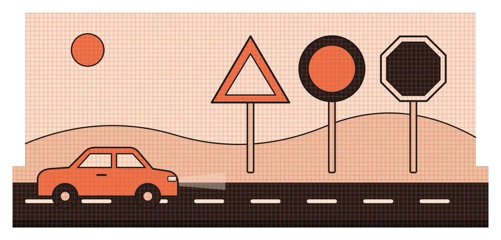
Road signs are one of the best everyday examples of shape doing serious work. Across much of the world, including India, the basic system is similar: a red-bordered triangle warns you of a hazard ahead, a circle tells you about something you must or mustn't do, and a red octagon means stop. The octagon was chosen for stop signs in the United States in the 1920s partly because it was so distinctive. Even from behind, or partly covered by snow or mud, a driver can recognise its outline and know what it means. That's the power of shape at its most practical. The meaning reaches you before you've had time to read the text, and sometimes even when you can't read it at all.
There's also research suggesting that we respond to the character of shapes emotionally. In 2006, the cognitive neuroscientists Moshe Bar and Maital Neta showed people pairs of everyday objects that were identical except for their contours, one version with sharp angles and one with smooth curves. People consistently liked the curved versions more. In a follow-up study, they found that sharp-angled objects produced more activity in the amygdala, a part of the brain linked to detecting threat. Their suggestion was that, over a long evolutionary history, sharp edges have often meant danger, from thorns and teeth to jagged rocks, so our brains treat them with a little more caution.
You can see designers using this, consciously or not, almost everywhere. Products meant to feel friendly and approachable, like many toys, kitchen gadgets and phone interfaces, lean on rounded corners and soft curves. Things meant to feel fast, aggressive or high-performance, like sports car details or certain energy drink logos, lean on sharp angles and points. Neither is better. The point is to choose on purpose, because the shape will send a message whether you mean it to or not.
The shape you didn't draw matters too
Every shape you draw creates a second shape at the same time: the space around it. Designers call the object itself the positive shape and the surrounding area the negative shape, or negative space. Beginners tend to focus only on the positive shapes, the things they meant to draw. Experienced designers pay just as much attention to the gaps, because the eye reads those too. A logo can feel cramped or open, a letter can look balanced or awkward, and a layout can feel calm or cluttered, all depending on the shapes of the empty spaces.
The most famous example in graphic design is hidden in plain sight. In 1994, the designer Lindon Leader, working at the branding agency Landor, created the current FedEx logo. Between the capital E and the small x, the negative space forms a clean white arrow pointing forwards. Most people see the logo for years before noticing it, and once they do, they can't stop seeing it. Leader and his team reportedly adjusted the letterforms carefully so the arrow would appear without making the lettering look odd. It's a perfect example of negative space carrying meaning without adding a single extra element.
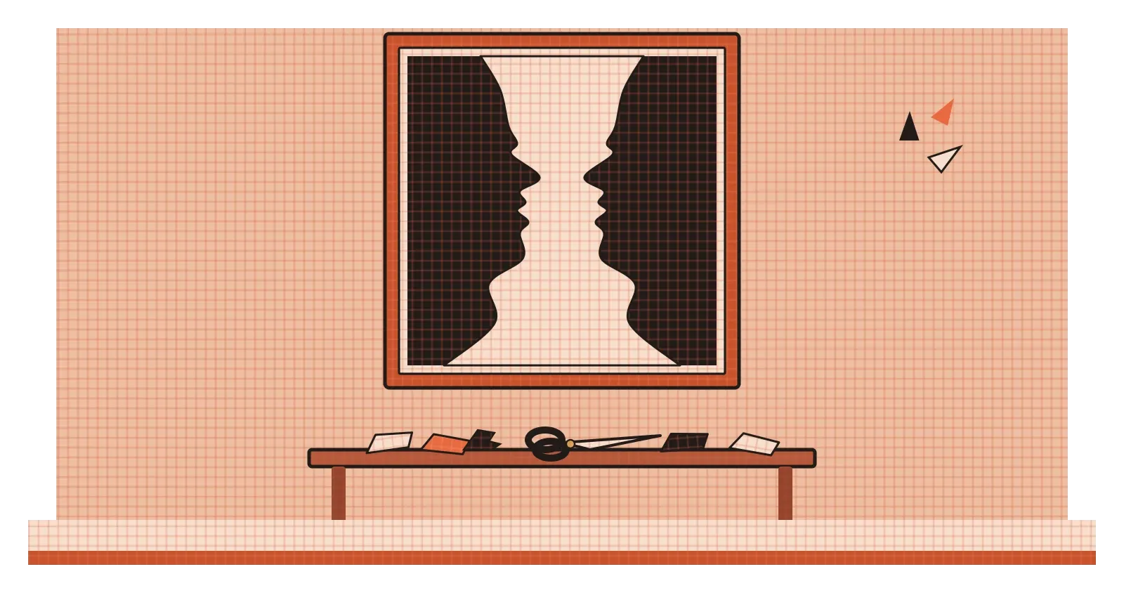
The Danish psychologist Edgar Rubin explored the same idea from a scientific angle in 1915, with the image now known as Rubin's vase. It can be seen either as a white vase in the middle or as two dark faces in profile looking at each other, and your eye flips between the two, unable to see both at once. That image belongs to a bigger idea called figure-ground, which I'll come back to in its own post. Artists have played with it too. In the last years of his life, when illness made painting difficult, Henri Matisse began cutting shapes directly out of painted paper, a technique he described as drawing with scissors. Look closely at his cut-outs and you can see how carefully he considered the spaces between the pieces, not just the pieces themselves.
On screens, shape is a promise about what something does
In interfaces, shapes do a lot of quiet explaining. A rounded rectangle with a solid fill usually means "press me". A circle often holds a person's photo or a single action, like the big round button in a camera app. A thin rectangle with a light border usually means "type here". A card with slightly rounded corners suggests that everything inside it belongs together. None of these are rules of nature. They're conventions we've all learned through years of tapping and clicking, and they work because they're consistent. Break them, for example by making a plain text label look exactly like a button, and people start pressing things that don't respond, which is one of the quickest ways to make a product feel broken.
The shape of the canvas itself is a design decision that's easy to forget. At Rocketium, I worked on tools for teams who produce advertising at enormous scale, sometimes thousands of versions of the same campaign. One of the most repetitive parts of their work was adapting a single design to many different sizes: a square post, a tall story, a wide banner and many more. The content stays the same, but the shape of the frame changes everything about how it's arranged. A headline that sits comfortably across a wide banner might need to stack into three lines in a tall format, and an image that fills a square might need to be cropped hard in a thin strip. Watching designers do this by hand, over and over, made me appreciate how much the outer shape of a design controls the inner one.
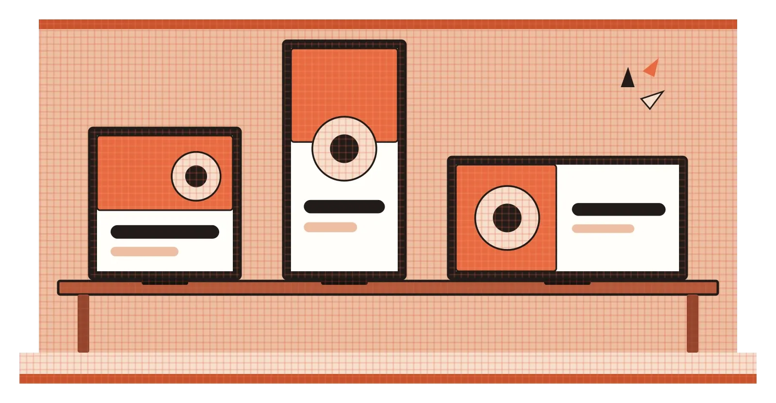
This is also why designers talk about shape at the smallest scale. A slightly different corner radius on buttons, icons or cards can make an entire product feel sharper or softer. Many design systems specify these values precisely and use them consistently, because small shape choices, repeated hundreds of times across an app, add up to a personality that people feel even if they never notice where it comes from.
Look at the shapes before anything else
Shape is one of the first things our eyes pick up and one of the last things we consciously think about. Long before someone reads your headline or notices your colour palette, they've already registered whether the shapes in front of them feel sharp or soft, orderly or loose, crowded or open. The bouba and kiki experiment, the octagonal stop sign and the hidden arrow in a logo all point to the same conclusion. Shape is a language in its own right, and people read it fluently without ever being taught.
The most useful habit I'd take from this is a simple one. When you're stuck on a design, squint at it until the details blur and only the big shapes are left. You'll often see problems that were invisible up close: a cluster of shapes all fighting for attention, an awkward gap that draws the eye, or a layout where nothing feels anchored. Then look at the negative space on purpose, as if it were the thing you designed. If the empty shapes look clumsy, the design usually feels clumsy too, even if every individual element is well made.
Kiki and Bouba are just two made-up words and two simple outlines, but almost everyone in the world agrees on which is which. That shared instinct is something designers get to work with every day. Used carelessly, it sends messages we never intended. Used with care, it lets a shape say "stop", "welcome", "press here" or "move forward" without a single word.
Further reading: Wolfgang Köhler, Gestalt Psychology (1929) · V. S. Ramachandran and Edward Hubbard, "Synaesthesia: A window into perception, thought and language" (2001) · Moshe Bar and Maital Neta, "Humans prefer curved visual objects" (2006) · Rudolf Arnheim, Art and Visual Perception (1954)