Form
What changes when a shape gains depth, weight and a back side you can't see.
Form
The pot that cools your water
In a lot of Indian homes, especially in summer, there's a clay pot in a corner of the kitchen. It goes by different names in different places, matka, ghada, kooja, but the design is remarkably similar everywhere: a round, swelling body, a narrower neck and a small mouth at the top, often with a little lid or a cloth over it. Fill it in the morning and by afternoon the water inside is noticeably cooler than the air around it. There's no electricity involved. The unglazed clay is slightly porous, so a little water seeps through to the outside surface and evaporates, carrying heat away with it.
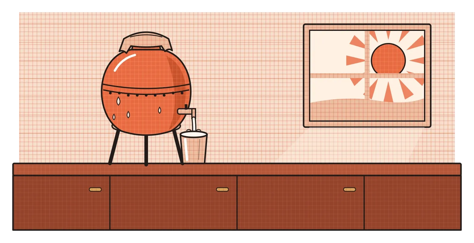
What I find beautiful about the matka is that its shape on paper tells you very little. Drawn as an outline, it's just a rounded silhouette. It's the three-dimensional version that does all the work. The round body holds a lot of water for its size and gives a large surface for evaporation. The narrow neck keeps dust and insects out and makes pouring easier to control. The weight of the clay keeps it steady on the floor or on its stand. Every one of those qualities comes from depth, volume and mass, from the fact that it exists in space and can be walked around and picked up. In design, that's the difference between shape and form, and it's the subject of this post.
When a shape gains depth
If a shape is a flat area with width and height, a form is what you get when you add depth. A circle becomes a sphere, a square becomes a cube, a triangle becomes a pyramid or a cone. Forms have volume, which is the space they take up, and mass, which is the sense of weight and solidity they carry. They also have a back that you can't see from where you're standing, which is a bigger deal than it sounds. A shape can be understood at a glance. A form invites you to move around it, and it looks different from every angle.
People have been fascinated by basic forms for a very long time. In ancient Greece, Plato connected five perfectly regular solids, the tetrahedron, cube, octahedron, dodecahedron and icosahedron, with the elements he believed made up the universe. They are still called the Platonic solids. Much later, in 1904, the French painter Paul Cézanne wrote to a younger artist that nature should be approached through the cylinder, the sphere and the cone. He didn't mean that artists should paint everything as geometric blocks. He meant that underneath the detail of a tree, a face or an apple, there are simple forms holding everything together, and that understanding them makes it easier to paint the detail convincingly. That idea fed directly into Cubism and into how drawing has been taught ever since.
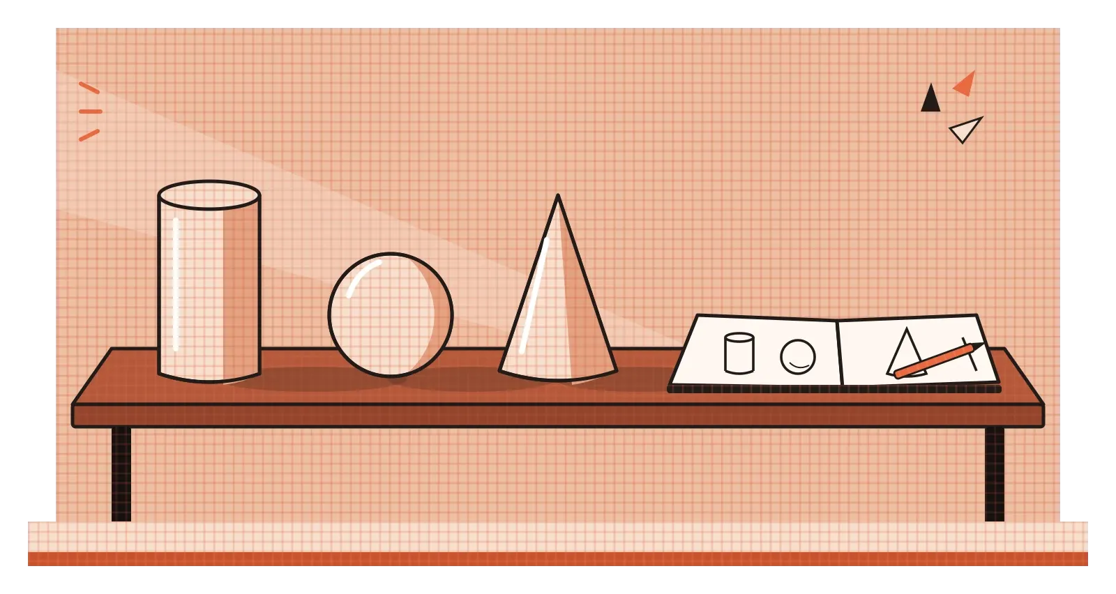
Like shapes, forms come in geometric and organic families. Geometric forms, like boxes, cylinders and spheres, feel engineered and precise, and they're easy to manufacture, stack and measure. Organic forms, like a pebble, a seashell or the curve of a hand, feel natural and are often more pleasant to touch. Designers usually work with both, and the mix gives an object its character. A good way to see this is to look at almost any household appliance. The overall body is often a simple geometric form, but the parts your hand touches, the handles, knobs and grips, tend to become softer and more organic.
A form can hold an idea
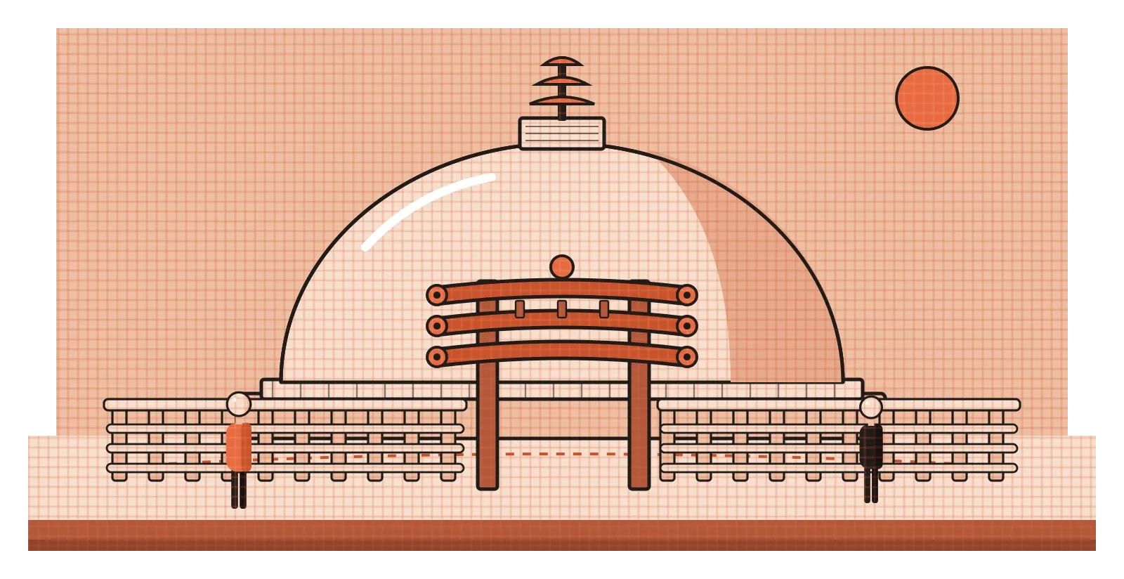
Some of the most powerful forms people have ever made are very simple. The Great Stupa at Sanchi, in Madhya Pradesh, began as a brick structure commissioned by the emperor Ashoka in the third century BCE and was enlarged and faced with stone in the following centuries. At its heart is a solid hemisphere, a dome traditionally called the anda, which means egg. It isn't a building you go inside. It's a form you walk around. Pilgrims follow a circular path around the dome, and the carved stone gateways added later frame the approach from each direction. The form does most of the communicating. A huge, calm, rounded mass rising from the ground feels complete and unshakeable, and the act of circling it turns the shape into an experience that unfolds over time. You understand the stupa with your feet as much as your eyes.
Form also includes the spaces inside and through an object. The British sculptor Henry Moore became famous for reclining figures with large holes opening right through their bodies. He was interested in the idea that a hole could be just as meaningful as a solid lump of stone or bronze, because it lets light, air and the view behind pass through the sculpture and connects the inside of the form to the outside. Walk around one of his pieces and the holes keep changing shape as your angle changes, framing different parts of the landscape. It's a good reminder that form isn't just about bulk. It's also about how solid and empty parts work together in three dimensions.
In product design, this is what people mean when they talk about form language: the consistent set of curves, edges, proportions and volumes that makes a family of objects feel related. A brand's kettles, toasters and blenders might each have a different job, but if they share the same rounded edges, the same flat tops and the same proportions, they read as belonging together. Just as with the stupa, the form says something before anyone has used the object at all.
Form is something you feel in your hand
With physical objects, form isn't only seen. It's held. The best-known story about this in product design started in an ordinary kitchen. In the late 1980s, Sam Farber, a retired businessman, noticed that his wife Betsey, who had arthritis in her hands, was struggling to use a standard vegetable peeler. The thin metal handle was painful to grip. Farber wondered why everyday kitchen tools couldn't be comfortable for everyone, and he worked with the New York design firm Smart Design to develop a new range of tools. The result, launched under the name OXO Good Grips in 1990, had thick, oval handles made of a soft, rubbery material, with flexible ridges where the thumb and fingers rest. The tools looked a little chunky compared to traditional ones. They were also dramatically easier to hold..
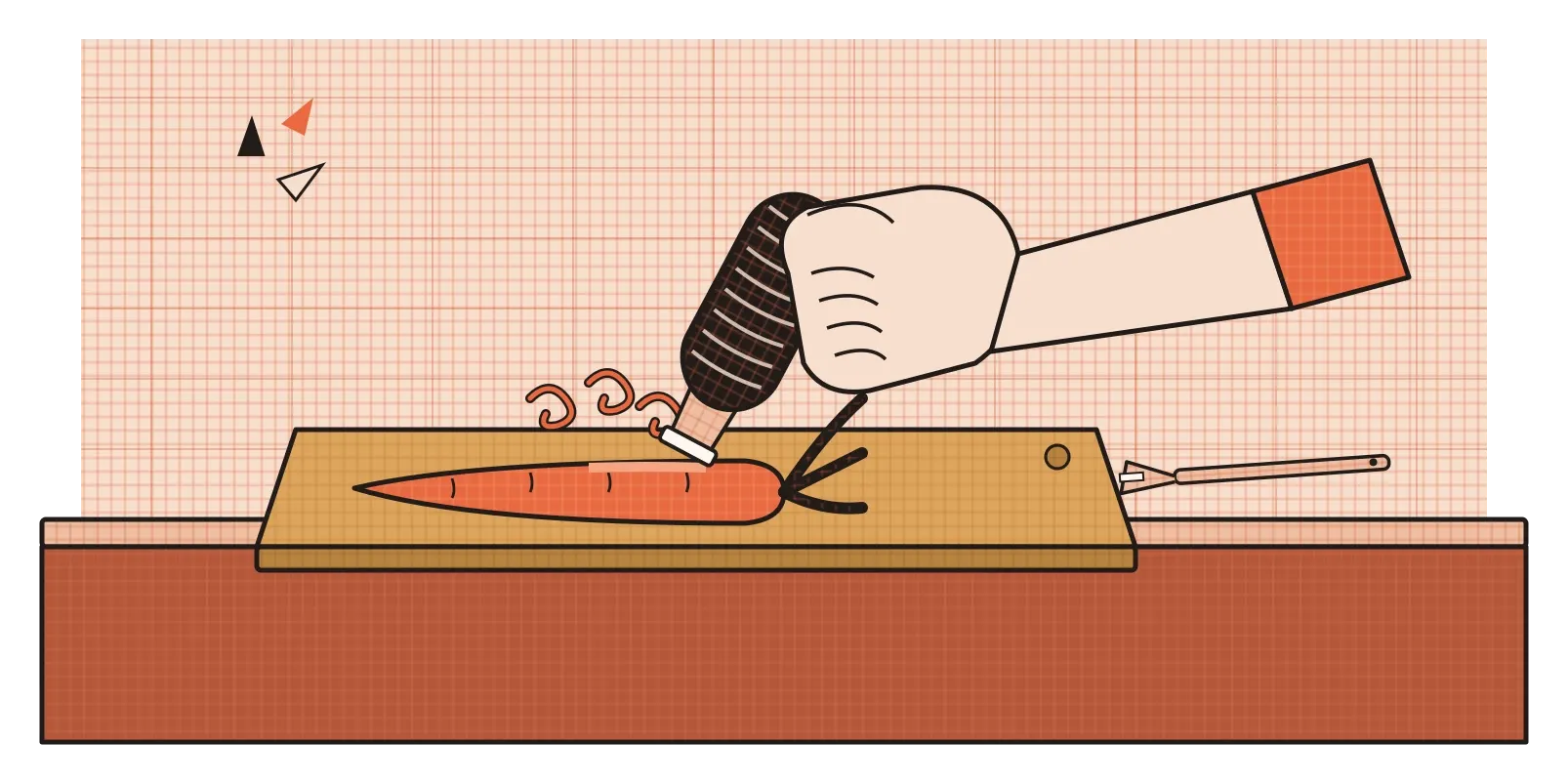
What happened next is the part I find most interesting. The tools weren't marketed as products for people with arthritis. They were sold to everyone, and everyone liked them, because a handle that's comfortable for a sore hand is also comfortable for a wet hand, a tired hand, a child's hand or the hand of someone who just doesn't like fighting with their peeler. It's one of the clearest examples of what's now called inclusive design: designing well for people at the edges often makes things better for everyone in the middle too. And all of it came down to form, to the thickness, curve and texture of the part your hand touches.
This is why industrial designers spend so much time with physical models, often made from foam, clay or cardboard, before anything is manufactured. A form that looks perfect on a screen can feel completely wrong in the hand. It might be too heavy at one end, too sharp along an edge, or slightly too wide to grip comfortably. Our hands notice these things immediately, even when our eyes don't, and no amount of beautiful rendering can replace actually picking the thing up
On a flat screen, form is an illusion we choose to create
Screens are flat, so any form you see on them is implied rather than real. For centuries, painters have created the illusion of form on flat surfaces using light and shadow, a skill I'll come back to in the post on value. Highlights, mid-tones and shadows tell your eye that a circle is actually a ball, or that a flat rectangle is actually a box with a top and sides. Interface designers use exactly the same tricks, just with different goals. The question isn't how to make something look realistic. It's how much depth people need in order to understand what they're looking at.
The last fifteen years of interface design have swung back and forth on this. Early smartphone apps used heavy gradients, glossy highlights and drop shadows so that buttons looked like physical objects you could press. Then flat design removed most of that, treating everything as a flat shape. In 2014, Google introduced Material Design, which took a middle path. It treated the interface like layers of paper stacked at different heights, and used subtle shadows to show which layer sat above which. A floating button casts a slightly larger shadow than a card lying underneath it, which tells you without words that the button is closer to you and more important right now. Around 2019 and 2020, there was a brief trend called neumorphism, where interface elements looked softly pressed into or raised out of the background. It looked lovely in still images, but the soft, low-contrast shadows made it hard for many people to tell what was a button and what wasn't, and the trend faded quickly.
What these swings teach, I think, is that implied form on a screen is a tool for meaning, not decoration. A little depth can make the structure of an interface clearer, showing what's on top, what can be pressed and what's in the background. Too much depth, or depth that's too subtle to see, gets in the way. As with the peeler handle, the right amount of form is whatever helps the person using it.
Walk around it before you decide
The jump from shape to form sounds like a small step, just adding one more dimension. In practice, it changes almost everything about how something is designed and experienced. Forms have weight and balance. They have backs and undersides. They interact with light, with the hand and with the body moving around them. A stupa is understood by walking around it, a peeler by gripping it, a matka by lifting it and pouring. None of those experiences can be fully captured in a flat drawing, which is why form demands a different kind of attention from designers.
The habit I'd take from this is to never judge a form from a single view. If you're designing a physical object, make a rough model as early as possible and turn it in your hands, look at it from below, from behind and from far away, and notice where it feels awkward. If you're designing on a screen, ask what the depth in your interface is actually saying. Is that shadow showing that something is on top, or is it just there because it looks nice? Either way, the question is the same: does the form help someone understand and use the thing, or is it only there to be looked at from one flattering angle?
The clay matka in the kitchen corner has been made in more or less the same form for a very long time, by potters most of us will never know the names of. It has survived because its form does exactly what it needs to. It holds water, keeps it clean, cools it without electricity and pours it neatly into a glass. That's the quiet ambition every form should have, to be so well fitted to its life that nobody thinks to change it.
Further reading: Paul Cézanne, letter to Émile Bernard (1904) · Rudolf Arnheim, Art and Visual Perception (1954) · Henry Dreyfuss, Designing for People (1955)