Line
How a single mark can lead the eye, carry a mood and hold a whole drawing together.
Line
A dot that went for a walk
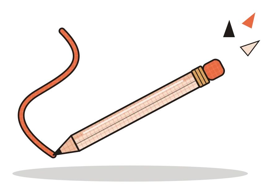
There's a description of line that almost every art and design student hears at some point: a line is a dot that went for a walk. It's usually credited to Paul Klee, the Swiss-German painter who taught at the Bauhaus alongside Kandinsky. The exact wording is a popular paraphrase rather than a direct quote. What Klee actually wrote, in his Pedagogical Sketchbook of 1925, was closer to describing an active line going for a walk, moving freely without a goal, simply for the sake of walking. But the shortened version stuck because it's so easy to picture. Put a pencil on paper and you've made a point. Start moving it, and the point leaves a trail behind it. That trail is a line.
I like this image because it explains something important that's easy to forget: a line is a record of movement. Even a perfectly straight line drawn with a ruler shows that something travelled from one place to another. Our eyes follow that movement automatically, which is why lines are one of the most powerful tools a designer has for directing attention. In the previous post, I wrote about the point, the smallest element in design, which holds a position. A line is what happens when that position starts to move, and almost every drawing, letter, map and interface we look at depends on it.
Lines draw edges, point directions and set a mood
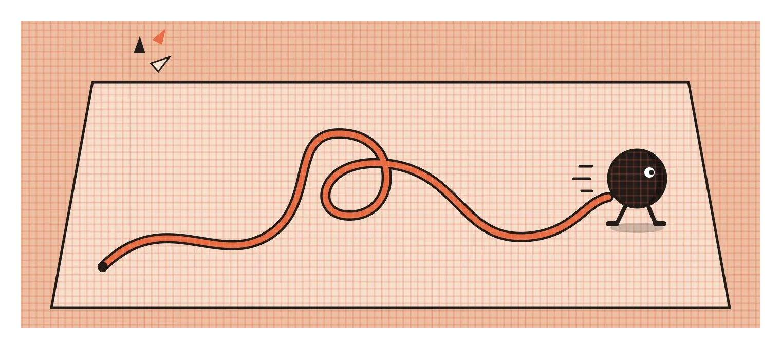
The most basic job a line does is to mark an edge. When we draw an apple, there's no actual black line around a real apple. There's just the place where the apple stops and the background begins. A contour line is our way of describing that boundary, and our brains accept it so easily that a few well-placed lines can make us see a face, a chair or a whole landscape. In 1941, the American art teacher Kimon Nicolaides published The Natural Way to Draw, which popularised an exercise many design students still do today, called blind contour drawing. You look only at the object, never at the paper, and let your hand slowly trace its edges as your eye moves around it. The drawings come out wobbly and strange, but the exercise teaches you to really look at where edges are, instead of drawing what you assume an object looks like.
Lines also have direction, and direction carries feeling. Horizontal lines tend to feel calm and stable, probably because they remind us of the horizon, the floor and things at rest. Vertical lines tend to feel strong and upright, like trees, columns or people standing tall, which is partly why tall Gothic cathedrals, full of soaring vertical lines, feel like they're reaching upwards. Diagonal lines feel like movement or instability, like something falling, climbing or running. These aren't strict laws, and context can change them, but they're consistent enough that designers use them all the time. A poster for a calm wellness retreat and a poster for a motorbike race will usually be built from very different kinds of line.
The third thing lines do is guide the eye. Photographers talk about leading lines, such as a road, a railway track or a row of trees, that draw your gaze towards the subject of a picture. Designers use the same trick constantly. An arrow, the edge of a photo, the direction someone in an image is looking, or a simple rule under a heading all tell your eye where to go next, often without you noticing.
Not all lines are equal
Two lines can follow exactly the same path and still feel completely different. One might be thick, confident and even. Another might be thin, shaky and broken. Designers call this the quality or character of a line, and it's one of the main ways a drawing expresses personality. In 1753, the English painter William Hogarth published The Analysis of Beauty, in which he argued that a gentle S-shaped curve, which he called the line of beauty, was more lively and pleasing than a straight line or a rigid geometric curve. You don't have to agree with him to notice that he was onto something. A softly curving line tends to feel organic and alive, a ruler-straight one feels engineered, and a jagged zigzag feels nervous or aggressive.
Line weight, meaning how thick or thin a line is, does a lot of practical work too. In product sketching, designers are taught to draw the outer silhouette of an object with a heavier line and the inner details with lighter ones. That simple difference makes the object pop off the page and helps the viewer understand which edges are closest to them. Architects use a similar system in technical drawings, where thicker lines show walls that have been cut through and thinner lines show things further away. In both cases, line weight is quietly telling you how to read the drawing.
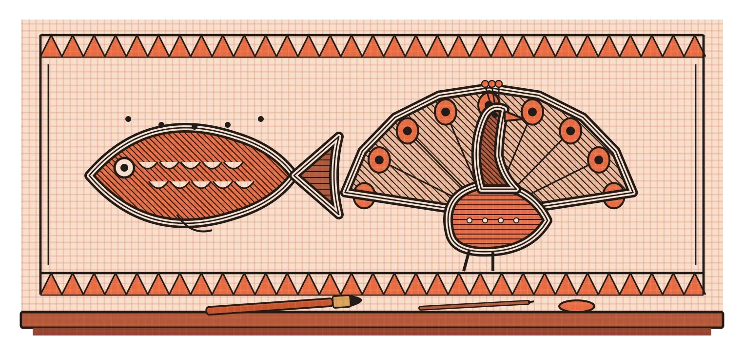
India has one of the most beautiful line traditions I know in Madhubani painting, also called Mithila painting, from the Mithila region of Bihar. Traditionally painted by women on the walls and floors of homes for rituals and celebrations, and later on paper and cloth, these paintings are built almost entirely from line. Figures, animals and plants are often outlined with a double line, and the space between and around them is filled with fine hatching, dots and repeated patterns, so that hardly any area is left empty. Artists have used twigs, nib pens, brushes and even matchsticks as tools. Looking closely at a Madhubani painting is a lesson in how much range a line can have, from bold outlines that define a fish or a peacock to tiny strokes that create texture and rhythm.
The map that won by telling a lie
Some of the most important lines in design aren't expressive at all. They organise information. The best-known example is the London Underground map. Before the 1930s, maps of the Underground tried to show where each line actually ran above ground, so central London became a tangle of crowded, curving routes while the outer stations were spread far apart. In 1931, an engineering draughtsman named Harry Beck, who had been working for the Underground, sketched a different idea in his spare time. He drew every route using only horizontal, vertical and 45-degree lines, spaced the stations evenly regardless of the real distances between them, and enlarged the crowded centre so it was easy to read.
Beck's map was, strictly speaking, inaccurate. It distorted distances and ignored the real shape of the city. The Underground's managers were reportedly unsure about it at first, but when a trial version was printed in 1933, passengers loved it. They didn't need to know exactly how far apart two stations were. They needed to know which line to take, where to change, and how many stops to go, and Beck's clean lines answered those questions instantly. People often compare the result to an electrical circuit diagram, which shows connections rather than physical layout. That approach became the model for transit maps all over the world, including the metro maps in Delhi, Mumbai and Bengaluru today.
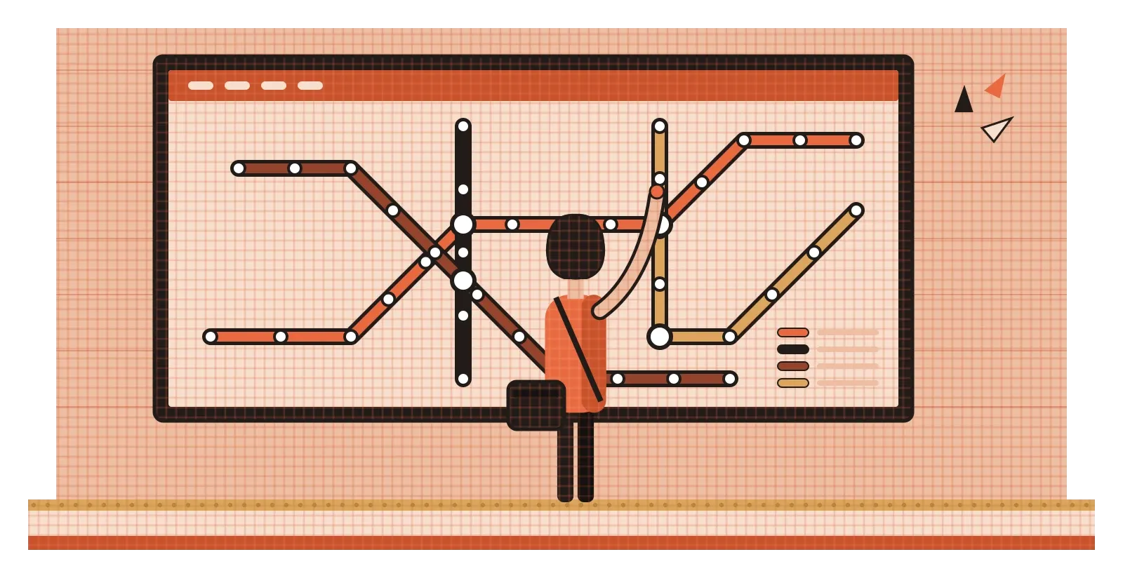
What makes Beck's map such a good lesson is that it shows line being used for clarity rather than realism. By limiting himself to a few angles, he made every route easier to follow with the eye, and by keeping lines straight, he made changes of direction meaningful. A bend in his map tells you something, because almost nothing else bends. That kind of restraint is at the heart of a lot of good information design. The fewer kinds of line you allow yourself, the more each one can say.
On screens, some of the most important lines are invisible
Interfaces are full of lines doing quiet, practical jobs. A thin rule separates one email from the next in your inbox. A border shows you where a text field begins and ends so you know where to type. An underline has told people "this is a link" since the early days of the web, which is why removing it can leave readers unsure what they can click. Over the last decade, as flat and minimal design became popular, many products stripped out borders and outlines to look cleaner. Some of that was a real improvement. But research from the Nielsen Norman Group, an influential usability consultancy, found in 2017 that very flat interface elements with weak visual cues made people slower and less certain about what was clickable. Sometimes a single line is the difference between a button and a piece of text that happens to be blue.
The most interesting lines in a layout, though, are often the ones nobody actually drew. When the left edges of a heading, a paragraph and an image all sit on the same vertical position, your eye sees a line running down the page, even though there isn't one. These are called implied lines, and good alignment is largely the art of creating them. They make a page feel organised and calm, and when they're broken, the page feels slightly off even if you can't say why. Our eyes are so keen to see lines that they'll connect a row of dots, follow the direction of someone's gaze in a photograph, or continue a curve that has been interrupted. A later post on Gestalt principles will go into this in more detail.
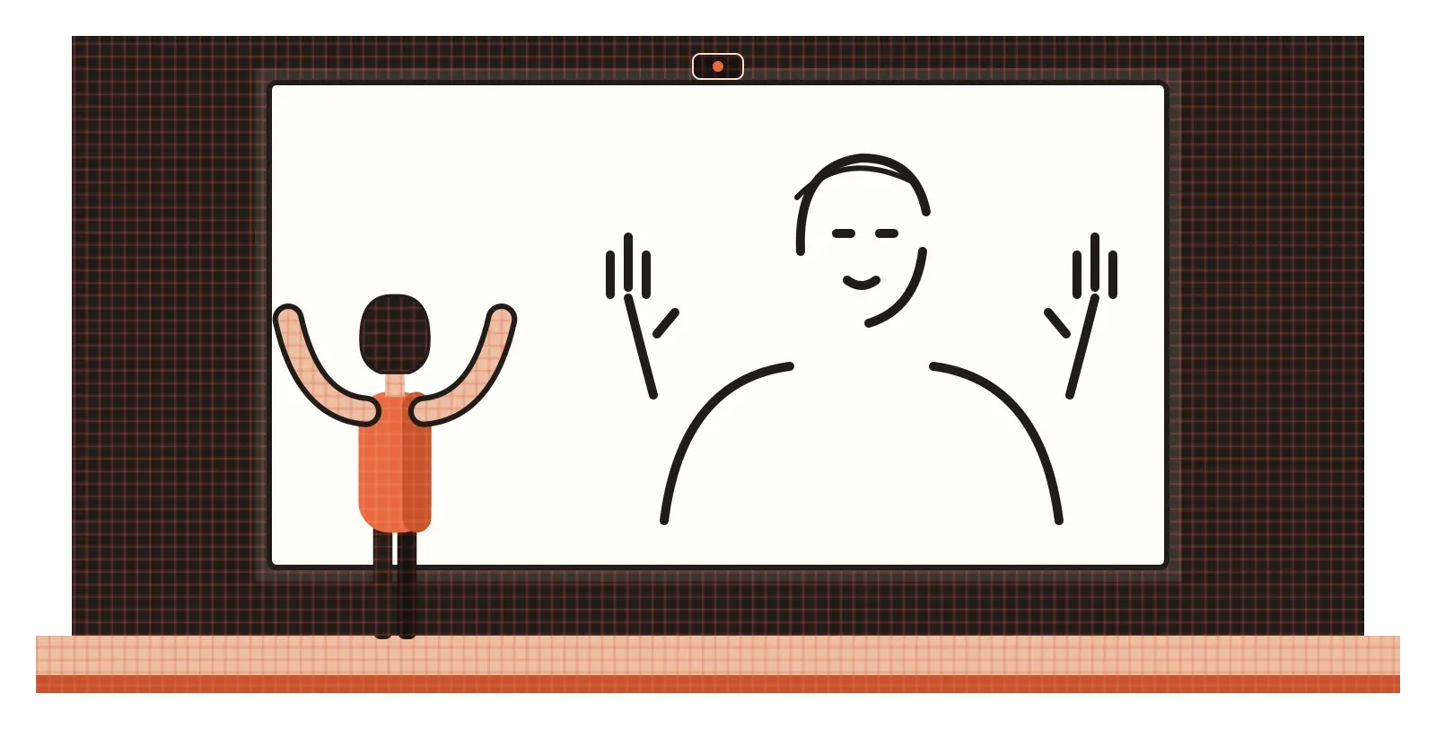
I got a small taste of how powerful line can be through a studio project I made, where a live camera feed was turned into black-and-white line drawings in real time. What struck me was how little line people needed to recognise themselves and each other. A handful of edges around the face, shoulders and hands was enough, and everything else could disappear. It's the same thing a good cartoonist or a quick fashion sketch shows you: a few confident lines in the right places can carry more information than a detailed picture.
Every line is a decision about where the eye should go
If the point is about position, the line is about direction. It tells the eye where an edge is, which way to travel and how to feel along the way. A soft curve, a rigid grid, a nervous scribble, a heavy outline and an invisible alignment are all lines, and each one shapes how a design is read. That's why I think line deserves more attention than it usually gets once students move on from first-year drawing classes. It doesn't stop being important when we start designing apps and posters. It just becomes less visible.
A useful habit is to look at any design you're working on and ask what the lines are doing, both the ones you drew and the ones you didn't. Where are the edges, and are they clear? Which way do the dominant lines run, and does that match the mood you want? What invisible lines does your alignment create, and are there places where they break for no good reason? Are there lines you could remove without losing clarity, or places where adding a single rule would help someone understand the structure? Answering those questions rarely takes long, and it often fixes problems that seemed to be about colour or layout.
Klee's dot went for a walk without any particular goal, just for the pleasure of moving. That's a lovely way to start a drawing, and it's how a lot of sketching begins. But in design, most of our lines eventually need a destination. They're carrying someone's eye from one place to another, and the best ones do it so smoothly that the viewer never notices they were being guided at all.
Further reading: Paul Klee, Pedagogical Sketchbook (1925) · Kimon Nicolaides, The Natural Way to Draw (1941) · William Hogarth, The Analysis of Beauty (1753) · Ken Garland, Mr Beck's Underground Map (1994)