Light, Shade and Rendering
How light falling on a surface tells us its shape, its material and where it sits in space.
Light, Shade and Rendering
Bumps or dents?
Here's a simple experiment. Imagine a grid of grey circles on a page. Each circle is shaded with a soft gradient, lighter at the top and darker at the bottom. Most people see them immediately as small bumps, rounded shapes sticking out of the page towards them. Now turn the page upside down, so that each circle is darker at the top and lighter at the bottom. Suddenly, they look like dents or hollows pressed into the surface. Nothing about the circles has changed except their orientation. Your brain has simply reinterpreted them.
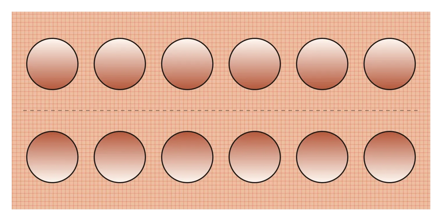
The neuroscientist V. S. Ramachandran, whose work on the bouba and kiki effect I mentioned in the post on shape, wrote about this kind of illusion in Scientific American in 1988. His explanation was that our visual system assumes, by default, that light comes from above. For most of human history, the main source of light has been the sun or the sky overhead, so a surface that's bright on top and dark underneath is most likely to be curving out towards us, catching light on its upper side. Flip the shading and the most likely explanation becomes a hollow. We don't decide this consciously. Our brains make the guess instantly, using light and shade as clues to shape. That's exactly the clue artists and designers use when they shade a drawing, render a product or add a shadow to a button. Light and shade aren't decoration. They're how flat images tell us about form, material and space.
What happens when light hits a ball
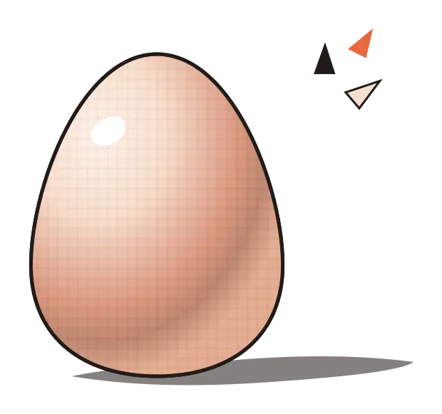
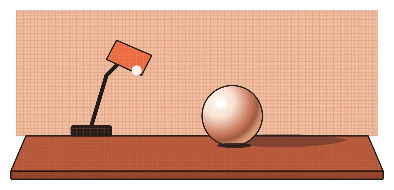
The classic way to learn about light and shade is to draw a simple white ball, or an egg, lit by a single lamp from one side. It sounds boring, but almost everything you need to know about rendering shows up on that one object. Start with the side facing the lamp. That's the light side, where the surface turns towards the light source and is brightest. Somewhere in that area is the highlight, a small, very bright spot where the light reflects most directly towards your eye. On a matte surface it's soft and gentle. On a shiny one it's sharp and intense.
Moving around the ball, you reach the place where the surface turns away from the light. Here the brightness drops quickly into the core shadow, the darkest band on the object itself, sometimes called the terminator, because it marks where the light ends. Beyond the core shadow, on the side facing away from the lamp, the surface often gets slightly lighter again. That's reflected light, light that has bounced off the table or nearby walls back onto the shadow side. Beginners often forget it and draw the shadow side as one flat black area, which makes objects look like cut-outs. A little reflected light makes them look round.
Finally, there's the cast shadow, the shadow the ball throws onto the surface it's resting on. It's usually darkest right where the ball touches the table, an area called the occlusion shadow or contact shadow, and gets softer and lighter as it stretches away. That small dark line where object meets surface does a surprising amount of work. Leave it out and the ball seems to float. Put it in and the ball sits firmly on the table. Highlight, light, core shadow, reflected light, cast shadow and contact shadow: once you know these six parts, you'll start seeing them on every object around you.
Light also tells you what something is made of
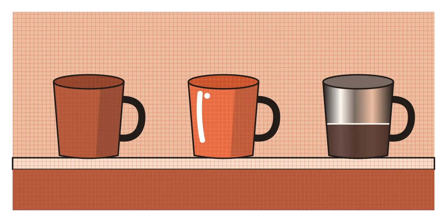
The same ball can look like chalk, rubber, plastic, polished steel or glass, depending only on how it's shaded. That's because different materials handle light in different ways, and our eyes are very good at reading those differences. A matte surface, like unglazed clay, paper or chalk, scatters light in every direction. Its shading changes gently and evenly from light to dark, and its highlight is soft and broad, sometimes barely visible. A glossy surface, like painted plastic or a ceramic mug, still shows its own colour and gentle shading, but adds a sharp, bright highlight on top, where it reflects the light source almost like a mirror.
Polished metal, like a chrome tap or a steel kettle, is different again. It has very little colour of its own. Instead, it reflects its surroundings, often in a distorted, stretched way. Product designers rendering chrome by hand often use a simple trick: they draw a soft horizon line across the object, with a lighter, sky-like tone above it and a darker, ground-like tone below, because that's roughly what a shiny surface reflects outdoors. Add a few sharp highlights and the object instantly looks metallic. Glass and clear plastic are the hardest of all, because they're both transparent and reflective. Much of what you draw is actually the background, bent and shifted as it passes through the object, with bright edges and a few crisp reflections.
This is why rendering is such an important skill for industrial designers. A designer presenting a concept for a speaker, a phone or a kitchen appliance needs people to understand not just its shape, but whether it's meant to be soft-touch plastic, brushed aluminium or polished glass. For decades, that was done with markers, pastels and coloured pencils on paper, building up tones and adding white highlights by hand. Today it's often done digitally, but the principles are exactly the same. Get the light right and the material speaks for itself.
When gods got shadows
For centuries, much Indian painting used light and shade sparingly. Mughal, Rajput and many temple painting traditions relied on line, flat areas of rich colour and careful pattern, with only gentle modelling of form. In the late nineteenth century, one painter changed how millions of Indians pictured their gods. Raja Ravi Varma, born in 1848 in Kilimanoor in present-day Kerala, learned oil painting largely on his own and absorbed European academic techniques, including modelling with light and shade, realistic skin tones and believable perspective. He used them to paint scenes from the Ramayana, the Mahabharata and Hindu mythology, showing gods, goddesses and heroines as solid, rounded, almost photographic figures, lit softly from one side, with folds of silk catching the light.
His biggest impact came from printing. In 1894 he set up a lithographic press in Bombay, which later moved to Malavli near Lonavala, to reproduce his paintings as cheap colour prints called oleographs. For the first time, ordinary families could hang realistic images of their gods at home. The prints spread across the country and shaped how deities were imagined for generations, influencing calendar art, posters and even early Indian cinema. Dadasaheb Phalke, often called the father of Indian cinema, worked with the press before making films.
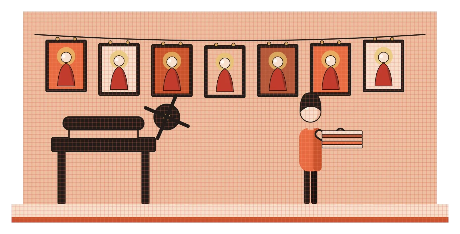
Not everyone admired this. In the early twentieth century, artists of the Bengal School, which I'll write about in a later post on movements, reacted against what they saw as Ravi Varma's overly Western style, and looked instead to older Indian and Asian traditions. That debate is a useful reminder that light and shade aren't neutral. Choosing realistic shading, or deliberately avoiding it, is a stylistic and even cultural decision. Ravi Varma's shadows made his gods feel present and real. Other artists felt the same shadows made them feel foreign.
Light and shadow on a screen
Interfaces quietly follow the same rules. Almost every operating system and design system assumes a light source somewhere above the screen, so shadows fall downwards, just below buttons, cards and menus. That matches the light-from-above assumption Ramachandran described. A button with a soft shadow beneath it looks raised and pressable. Flip the shadow so it appears above the button, and the button suddenly looks pressed in, or simply wrong. Google's Material Design, which I mentioned in the posts on form and figure and ground, made this explicit with its system of elevation, where elements higher above the surface cast larger, softer shadows. One of the easiest ways to make an interface feel slightly broken is to use shadows that come from different directions on the same screen. Most people can't say what's wrong, but they feel it.
The biggest change in rendering over the last few decades has been computer graphics. Instead of shading by hand, designers can now build a 3D model, place virtual lights around it and let software calculate how light bounces around the scene. A major step was a 1980 paper by the computer scientist Turner Whitted describing ray tracing, a method that follows individual rays of light as they bounce, reflect and refract, which made realistic reflections and transparent materials far easier to produce. Today, rendering is so convincing that many product images people assume are photographs are actually computer-generated. In 2014, for example, it was widely reported that most of the product images in IKEA's catalogue were made with 3D rendering rather than photography.
For designers, this is both a gift and a trap. Software can calculate light perfectly, but it can't decide what the image should communicate. Choosing where to put the light, how strong the shadows should be, which highlights to emphasise and what mood to create is still a design decision, and it relies on exactly the same understanding of light and form that comes from drawing an egg under a lamp.
Pick one light, and be consistent
Light and shade bring together almost everything in the first part of this series. Value gives us the range from light to dark. Form gives us the shapes for light to fall on. Texture and material decide how that light behaves. Space and perspective decide where the shadows go. Rendering is where all of it comes together into an image that tells people, at a glance, what something is, what it's made of and where it sits in the world.
The single most useful habit I'd take from this is to decide where your light is coming from before you add any shading, and then stick to it. Whether you're sketching a product, painting an illustration or adding shadows to an interface, choose one main light direction and make every highlight, core shadow and cast shadow agree with it. Then add the small details that make things feel real: a little reflected light on the shadow side, a dark contact shadow where an object touches the ground, and a highlight that matches the material, soft for matte, sharp for glossy. If you want to practise, put an egg or a white ball under a desk lamp and draw it a few times from different angles. It's one of the oldest exercises in art school because it's one of the most useful.
The bumps-and-dents illusion is a reminder of how much work our brains do with a simple gradient. Shading a circle lighter at the top is enough to make it pop out of the page. Shading it the other way is enough to push it in. Every rendering, from Ravi Varma's gods to a shadow under a button, depends on that same instinct. Light, used consistently, is one of the most convincing tools a designer has.
Further reading: V. S. Ramachandran, "Perceiving Shape from Shading" (1988) · Scott Robertson, How to Render (2014) · Rupika Chawla, Raja Ravi Varma: Painter of Colonial India (2010)