Hierarchy
How designers put information in order, so people find what they need without reading everything.
Hierarchy
Three seconds to read a bus
Stand at a busy bus stop in almost any Indian city and watch people as a bus approaches. Nobody reads the whole front of the bus. Most people glance at one thing first, the route number, usually the largest and brightest element on the display. If it's not their number, they look away and the bus is gone. If it is, their eyes move to the next level down, the destination, to check which direction it's heading. Only a few people, usually those unsure of the route, look further for the smaller text listing the main stops along the way. The whole exchange takes a few seconds, often while the bus is still moving.
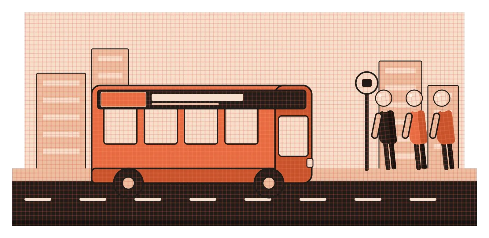
That display works because its information has been put in a clear order of importance, and the design makes that order obvious. The most important piece is the biggest, the second most important is smaller, and the details are smallest of all. Nobody has to be taught how to read it. Designers call this hierarchy, and it's one of the most useful principles in the whole field. In the last post, I wrote about emphasis, which decides what people see first. Hierarchy is the bigger picture: the full ranking of everything on a page or screen, from what matters most to what can safely be ignored until it's needed.
Most people don't read, they scan
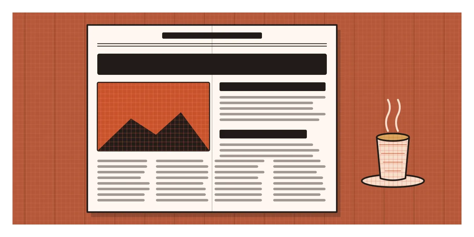
Hierarchy matters so much because people rarely read things the way designers hope they will. In 1997, the usability researcher Jakob Nielsen published a short study about how people read on the web. His team found that most of the people they tested, 79 percent, scanned pages instead of reading them word by word, picking out individual words and sentences. Only a small minority read line by line. Later eye-tracking research by his group showed similar patterns, and the same behaviour is easy to spot offline too. We skim newspapers, flick through menus, glance at forms and jump straight to the part we think matters.
A clear hierarchy is what makes skimming work. It acts like a map of the content. The big headline tells you what this is about. The subheadings tell you how it's divided. Bold text, highlighted numbers or a coloured button tell you where the key points or actions are. If the hierarchy is clear, a person can understand the shape of a page in a few seconds and decide where to spend their attention. If it isn't, they either have to read everything, which most people won't, or they miss what they came for.
There are really two hierarchies at work in any design, and they need to match. The first is the information hierarchy, the actual order of importance of the content, which comes from understanding what people need. The second is the visual hierarchy, the order in which the design makes things noticeable. Problems usually come from a mismatch between them. A page where the company's slogan is huge and the price is tiny, when people mostly came for the price, has a visual hierarchy that doesn't match its information hierarchy. Fixing it usually isn't about decoration. It's about first agreeing what matters most, and then making the design say so.
How designers build levels
The tools for building hierarchy are the same ones we've met throughout this series, now used together and in a planned order. Size is the strongest and most obvious, so bigger things read as more important. Weight is next, with bold text standing above regular text of the same size. Value and colour come after that, so a dark heading stands out from mid-grey body text, and a single accent colour can mark the most important action. Position matters too. Things at the top of a page or screen, or at the start of a reading line, are usually seen first, so important information tends to go there.
Space and grouping are less obvious but just as powerful. Elements that sit close together read as one group, and more space above a heading than below it makes the heading clearly belong to the section underneath. Indentation, dividing lines and boxes can show which items are children of which, the way a nested list does in a document. Even the amount of white space around an element can signal its importance, since, as I mentioned in the post on space, emptiness tends to act like a spotlight.
A common mistake is using too many levels. If a page has seven different sizes of text, three weights, four colours and several different styles of heading, readers can't hold the system in their heads, and it stops feeling like a hierarchy at all. Many typographers suggest that most pages work well with about three clear levels: a main heading, subheadings and body text, with perhaps one smaller level for captions and notes. Each level should be clearly different from the next, not just slightly bigger or slightly bolder. If you need to squint to tell two levels apart, they probably shouldn't be two levels.
When getting the order wrong can hurt someone
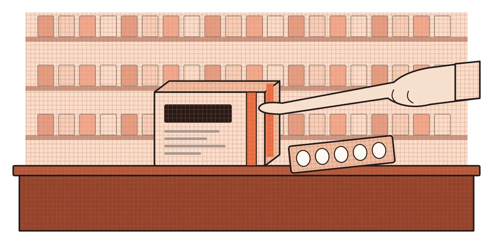
On most screens, a poor hierarchy is frustrating. On a medicine box, it can be dangerous. Pick up a strip of tablets and you'll often see that the brand name is the biggest and boldest text, while the actual drug inside, the generic or active ingredient, and its strength are in much smaller type. From a marketing point of view, that order makes sense, because companies want people to remember the brand. From a safety point of view, it's almost backwards. A patient or a pharmacist really needs to know what the medicine is, how strong it is and how to take it. Health organisations, including the World Health Organization, have long warned about medication errors caused by packaging that looks too similar, or that hides the most important information.
India offers a nice example of hierarchy being used for public health. In 2016, the Ministry of Health promoted what became known as the Red Line campaign, encouraging people to notice a red vertical line printed on the packaging of certain antibiotics that should only be sold with a doctor's prescription. The idea was to fight the overuse of antibiotics, which contributes to drug-resistant infections. The red line is a very simple piece of design, but its job is to sit at the top of the hierarchy for one specific message: don't take this without a prescription. A single strong mark is meant to cut through all the brand names and small print and communicate one thing instantly, even to someone who doesn't read the rest of the label.
Medical labels are an extreme case, but they make the principle very clear. Hierarchy isn't only about making things look tidy. It's about deciding, on behalf of the people using a design, which information they absolutely must not miss, and then making sure the design puts that information first.
Hierarchy for people who can't see it
It's easy to think of hierarchy as purely visual, but on the web it has a second, invisible layer. People who are blind or have low vision often use screen readers, software that reads the contents of a page aloud or sends it to a refreshable Braille display. Listening to a whole web page from top to bottom would take a very long time, so screen reader users rarely do that. Instead, they jump around the page using its structure, especially its headings. In the surveys of screen reader users that the accessibility organisation WebAIM has run for many years, a large majority have consistently said that navigating by headings is their main way of finding information on a long page.
This only works if the headings are built properly. Web pages have a built-in system of heading levels, usually called H1 to H6, where H1 is the main title and the others are progressively smaller sections inside it. A screen reader can list all of these headings and let someone jump straight to the one they want, a bit like reading a table of contents. Problems start when designers create headings that only look like headings, for example by making ordinary text larger and bolder without marking it as a heading in the code. To a sighted reader, the page looks perfectly organised. To a screen reader user, it can sound like one long, undivided block of text with no way to skim.

The lesson for designers is that the visual hierarchy and the underlying structure have to tell the same story. When a design hands off to developers, it helps to label which text is a main heading, which is a subheading and which is body text, rather than only specifying sizes and weights. A well-structured hierarchy then works for everyone at once. Sighted people scan it by size and weight, and screen reader users navigate it by its levels. Both are following the same map.
Rank first, then style
Hierarchy is one of those principles that sounds obvious until you try to apply it. Everyone agrees that important things should look important. The hard part is agreeing what's actually important, especially when different people on a team want different things to be noticed first. That's why I think hierarchy is as much a conversation as it is a visual skill. The design can only be as clear as the decisions behind it.
A habit that helps is to rank the content before styling anything. Write down every piece of information that will appear on the page or screen, then put it in order from most to least important for the person using it, not for the people who made it. Group the items into three or four levels at most. Only then start deciding on sizes, weights, colours and positions, making sure each level is clearly different from the next. When you're done, test it the same way people actually use designs: glance at it for a few seconds and see what you notice, then check that the order you notice things in matches the order you wrote down. And if it's a web page, check that the structure in the code matches the structure on screen.
The front of a city bus does all of this in a few square feet of display, and millions of people read it correctly every day without thinking about it. That's the goal for any hierarchy. When it's done well, nobody notices it at all. They just find what they need, quickly and confidently, and get on with their day.
Further reading: Jakob Nielsen, "How Users Read on the Web" (1997) · WebAIM, Screen Reader User Survey (multiple years) · Ellen Lupton, Thinking with Type (2004)