Rhythm and Repetition
How patterns move the eye, build unity and make a single change stand out.
Rhythm and Repetition
Thousands of steps going down
In the village of Abhaneri in Rajasthan, there's a stepwell called Chand Baori that looks almost unreal the first time you see a photo of it. Built more than a thousand years ago, usually dated to around the eighth or ninth century, it's a deep, square pit cut into the ground, with water at the bottom and three of its sides lined with flights of narrow steps. The steps zigzag down in criss-crossing double flights, level after level, around thirteen storeys deep, and they're often said to number around three and a half thousand. From the top, the walls look like a giant woven pattern of tiny triangles, light on one side and shadow on the other, repeating over and over until they reach the water.
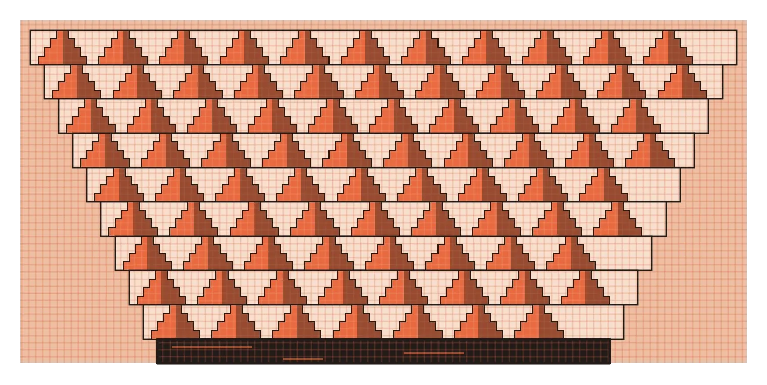
Stepwells like this were practical structures. In a dry region, they gave people year-round access to groundwater, and the deep, shaded pit stayed noticeably cooler than the air above. But Chand Baori is also one of the most powerful examples I know of what repetition can do. A single flight of steps is just a staircase. Repeated hundreds of times in a strict pattern, the same simple element becomes hypnotic. Your eye follows the zigzags down, up and across, and the structure feels almost like music made out of stone. In design, that sense of movement created by repeated elements is called rhythm, and it's the subject of this post.
Beats and the gaps between them
The word rhythm comes from music, and the musical idea is the easiest way to understand it in design. A musical rhythm is made of beats and the gaps between them. A steady drumbeat, with every beat the same and every gap the same, feels regular and predictable. Change the gaps or make some beats stronger than others, and the rhythm becomes more interesting. Visual rhythm works in exactly the same way. The beats are the repeated elements, like windows on a building, columns in a temple hall, dots in a pattern or cards in an app. The gaps are the spaces between them. Together, they create a pattern that the eye can follow.
Repetition is the raw material of rhythm. Repeat a shape, a colour, a line or a texture, and the viewer starts to recognise a pattern. That recognition is satisfying in itself, because our brains are constantly looking for order in what we see. It also creates movement. When you look at a row of repeated elements, your eye naturally travels along them, the way it follows the steps in Chand Baori. Designers use that movement to guide people through a layout, from one item to the next, without needing arrows or instructions.
There's an important difference between repetition and rhythm, though. Repetition simply means using the same element more than once. Rhythm is what happens when repetition is organised, when the elements and the spaces between them follow a pattern that creates a sense of flow. Ten identical buttons scattered randomly across a screen are repeated, but they don't have rhythm. The same ten buttons lined up in a neat row with even spacing do. The difference is all in how the gaps are designed.
Not all rhythms are the same
Designers usually describe a few different kinds of rhythm. The simplest is regular rhythm, where the same element repeats at equal intervals, like the evenly spaced windows on an office block or the posts of a fence. It feels calm, orderly and dependable, which is why it's so common in architecture, grids and interfaces. Alternating rhythm uses two or more elements that take turns, like black and white tiles on a chessboard, or a row of pillars alternating with carved niches. It adds a bit more interest while still feeling predictable.
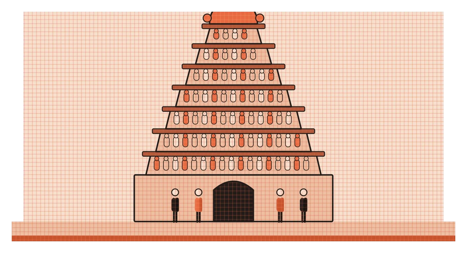
Progressive rhythm is where things get more dynamic. Here, the repeated element changes gradually as it repeats, getting bigger or smaller, lighter or darker, closer together or further apart. South Indian temple gateways, called gopurams, are a wonderful example. At the Meenakshi Temple in Madurai, the tall gopurams rise in a series of stacked tiers, each one slightly narrower than the one below, covered with hundreds of brightly painted sculptures of gods, animals and mythical figures. The tiers repeat, but they shrink as they climb, which makes the towers look even taller than they are and pulls the eye upwards towards the top. Progressive rhythm creates a sense of direction and growth, and you'll see it everywhere from staircases that narrow towards a doorway to charts where bars rise step by step.
There's also flowing rhythm, which uses curves rather than straight repeats, like waves on water, ripples in sand or the looping lines of a kolam around its dots. It feels natural and graceful rather than mechanical. And there's random or irregular rhythm, where elements repeat without a strict pattern, like leaves on the ground or paint spattered across a canvas. It can feel lively and spontaneous, but it's harder to control, and too much of it simply reads as mess. Most strong designs pick one main kind of rhythm and use it consistently, perhaps with a second, quieter rhythm underneath.
Repetition holds a design together
Beyond creating movement, repetition does something quieter but just as important. It ties a design together. When the same colours, typefaces, shapes and spacing appear again and again across a poster, a website or a product, they signal that everything belongs to one family. That's the basis of brand identity. A company that uses the same colour, logo and style of photography everywhere becomes recognisable at a glance, even before you read its name. It's also the basis of the illustrations on this blog, which all repeat the same palette, grid texture and flat style, so that each new image immediately feels part of the same set.
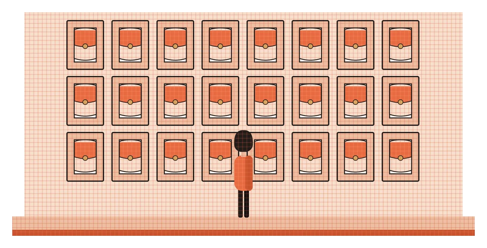
Artists have used repetition to carry meaning as well. In 1962, Andy Warhol exhibited thirty-two canvases, each showing a can of Campbell's soup, one for every flavour the company sold at the time. Hung together in rows, they looked almost like products on a supermarket shelf. The repetition was the point. Warhol was holding up a mirror to a world of mass production and mass advertising, where the same things are made, sold and seen over and over. The same year, he made works that repeated a single photograph of Marilyn Monroe many times, some copies bright and some fading away, which many people read as a comment on fame and how images of celebrities are endlessly reproduced.
In digital products, repetition is what makes an interface learnable. If every primary button looks the same, every error message appears in the same place and every card follows the same layout, people only have to learn the pattern once. After that, they can predict how everything else works. That's why design teams build design systems, shared libraries of components and rules, so that repetition across a large product happens on purpose rather than by accident. Consistency might sound boring, but for the person using a product, it's a huge relief. They can stop thinking about the interface and think about what they actually came to do.
Good repetition, bad repetition, and the beat you skip
Repetition in a design is usually a good thing. Repetition in someone's work is often the opposite. I saw this clearly while working on an agentic AI system at Rocketium, a platform for teams producing advertising at very large scale. When I spent time watching the in-house design team, their day was dominated by the same sequence of steps repeated over and over: reading a brief, setting up a template, adding sizes and variants, running bulk operations, and so on, for campaign after campaign, sometimes running into thousands of creatives. None of those steps needed a creative decision. They were just the same motions, repeated. The idea behind the system we designed was to hand that repetition over to AI agents, so that designers could spend their time on the decisions that actually needed them.
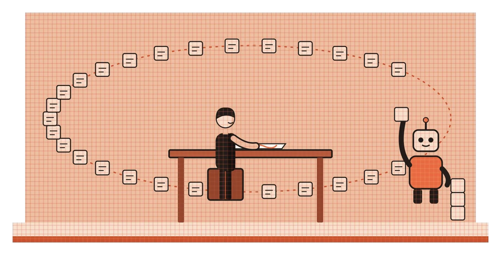
I find that contrast useful to keep in mind. Repetition is wonderful when it helps people recognise patterns, find their way and feel at home. It's draining when it asks people to perform the same task again and again without thought. Good design tends to put repetition into the interface and take it out of the work.
The other thing worth knowing about rhythm is that its power comes partly from what happens when it breaks. Once a viewer has learned a pattern, any change to it stands out immediately. A single red tile in a floor of white ones, one window lit in a dark building, or one card in a grid that's twice the size of the others will all grab attention, because they interrupt something the eye had settled into. This is the von Restorff effect from the post on contrast, working through rhythm. Designers use it deliberately to highlight a featured item, a new message or a special offer. But it only works if the rhythm is strong in the first place, and if the break is rare. A pattern that breaks every few steps isn't a rhythm any more, and nothing stands out at all.
Set the beat, then decide where to break it
Rhythm and repetition are where design starts to feel less like a collection of separate decisions and more like a system. A single element is a choice. The same element repeated with care becomes a pattern, and a pattern gives people something to follow, recognise and trust. That's true of a stepwell, a temple tower, a wall of soup cans in a gallery and a list of cards in an app. In each case, the repetition creates order, and the order creates a kind of calm, even when the design itself is full of energy.
The practical habit I'd take from this is to design your repeats on purpose. Decide which elements should always look the same, like buttons, headings, cards, icons and spacing, and keep them consistent across everything you make. Pay attention to the gaps as much as the elements, because uneven spacing breaks a rhythm faster than almost anything else. Choose the kind of rhythm that suits the mood you want, regular for calm, progressive for growth and direction, flowing for softness. Then, only once the pattern is strong, decide where a single break would help, and keep those breaks rare enough that they still mean something.
Chand Baori's steps have been repeating down into the earth for over a thousand years, and people still travel to stand at the edge and look down at them. A single staircase would never have that effect. It's the patient, disciplined repetition that turns something practical into something unforgettable. That's what rhythm can do for any design. It takes simple parts and, through careful repetition, makes the whole feel greater than they could ever be on their own.
Further reading: Ellen Lupton and Jennifer Cole Phillips, Graphic Design: The New Basics (2008) · Morna Livingston, Steps to Water: The Ancient Stepwells of India (2002)