Emphasis and Focal Point
How designers decide where your eyes go first, and why every design needs a place to land.
Emphasis and Focal Point
A beam of light across a dark room
In a church in Rome called San Luigi dei Francesi, there's a painting by Caravaggio, finished around 1600, called The Calling of Saint Matthew. It shows a dim room where a group of men sit around a table counting money. On the right, almost lost in shadow, Christ stands and points towards them. Above him, a sharp beam of light cuts diagonally across the dark wall and falls on the faces of the men at the table, especially on one of them, who points at himself as if to ask, "Me?" Art historians still argue about exactly which figure is Matthew, but the light, the pointing hands and the gestures all lead your eye to the same group, and the whole painting turns on that moment of recognition.
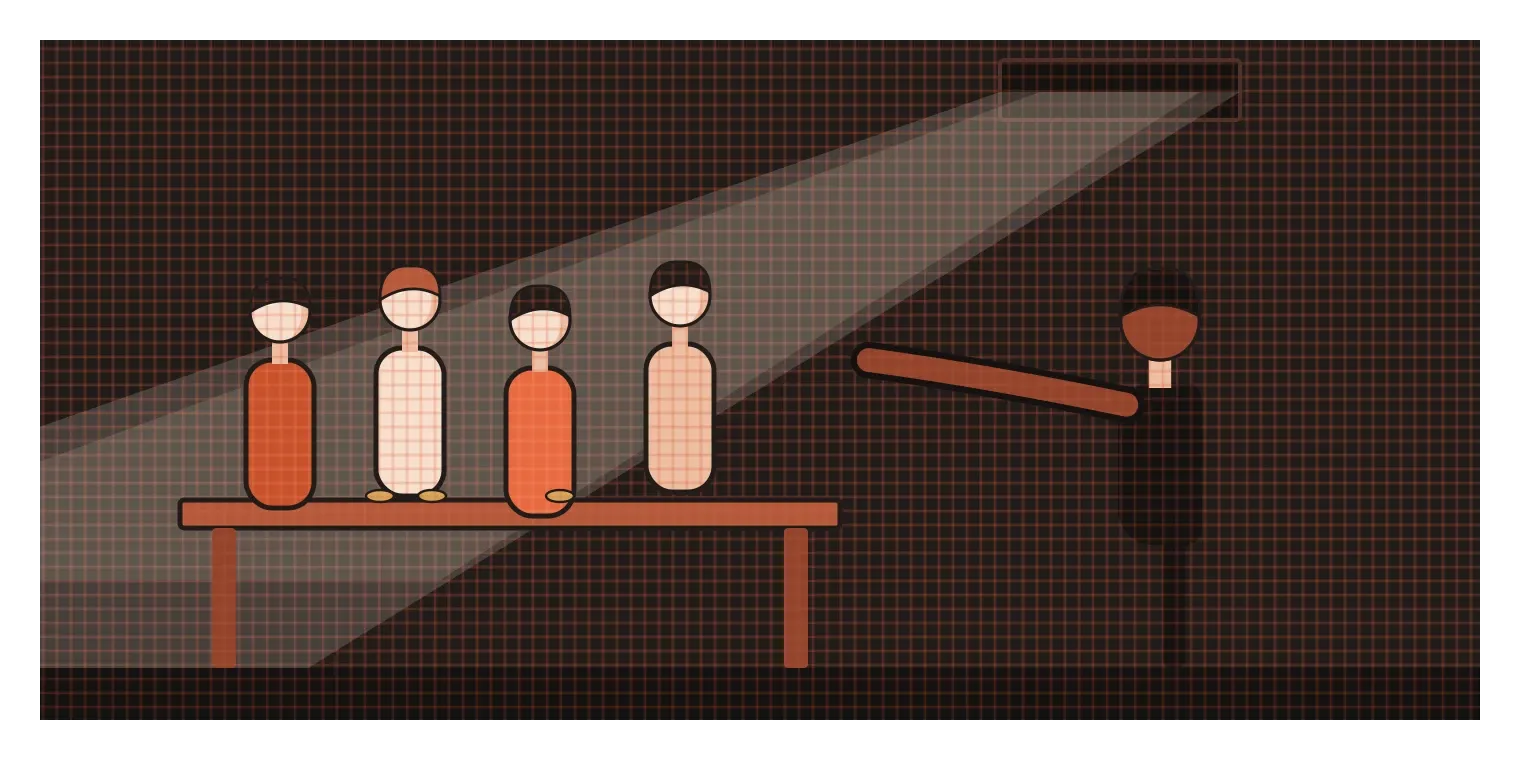
What makes it so effective is that Caravaggio doesn't leave anything to chance. He uses almost every tool a designer has, light against dark, direction, gesture and the gaze of the figures, to make sure you look exactly where he wants you to look, in the order he wants you to look there. The painting is full of interesting details, but there is never any doubt about what matters most. Designers call that the focal point, the place the eye goes first, and the techniques used to create it are called emphasis. Every good design, whether it's a painting, a poster or a phone screen, needs one.
A place for the eye to land
Emphasis is the principle of making one part of a design stand out more than the rest. The focal point is the result, the specific spot where attention lands first. In the last post, I wrote about contrast as the basic mechanism behind noticing anything. Emphasis is what happens when you use contrast deliberately to answer one question: what should people look at first?
It's worth separating emphasis from hierarchy, which is the topic of the next post, because they're closely related. Hierarchy is about the full order of importance across a design, first, second, third and so on. Emphasis is about the top of that order, the one element that leads. A good way to think about it is a stage play. The hierarchy is the whole cast, with leads, supporting characters and extras. The focal point is whoever is standing in the spotlight right now.
Without a focal point, a design feels confusing or flat. The eye wanders from element to element without settling, and people often give up before they find what they came for. With too many focal points, it's even worse. Everything competes, and the design feels noisy and tiring. Most strong designs have one clear primary focal point, perhaps a secondary one or two, and everything else plays a supporting role. That doesn't mean the rest is unimportant. It means the rest has agreed to wait its turn.
The tools designers use to direct the eye
There are a handful of reliable ways to create a focal point, and most good designs combine several of them. The first is contrast, which I covered in the last post: the brightest, darkest, most colourful or most unusual element tends to win. The second is size. Bigger things usually get noticed first, which is why headlines are large and why the hero image on a website often fills most of the screen. The third is isolation. An element surrounded by empty space stands out even if it's small, because nothing nearby competes with it. A single word in the middle of a blank page can be more powerful than a whole paragraph.
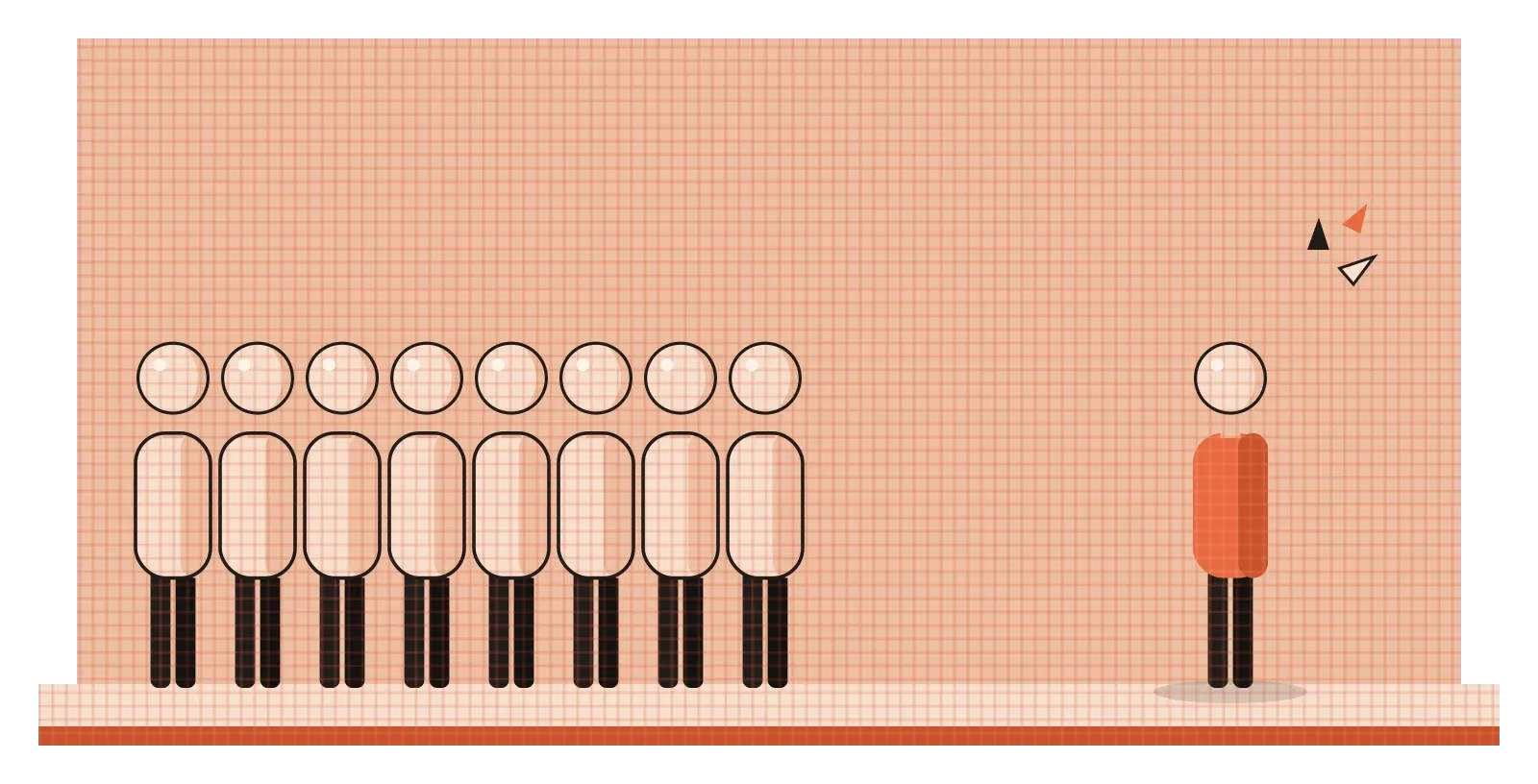
The fourth tool is placement. Elements near the optical centre of a frame, or at strong positions like the intersections used in the rule of thirds, which I'll cover in a later post, tend to attract more attention than those tucked into a corner. The fifth is convergence. Lines that point towards something, like the beam of light in Caravaggio's painting, a road narrowing into the distance or a row of objects leading to one spot, carry the eye along with them. The sixth is direction of gaze. Psychologists have found that people automatically shift their attention towards whatever someone else is looking at. In 1998, Chris Friesen and Alan Kingstone showed that even a simple cartoon face looking left or right was enough to make people respond faster to things on that side. That's why photos in adverts and websites often show people looking towards the product or headline, rather than straight out at the viewer.
There are other tools too. Faces of any kind attract attention very quickly, so a face in an image will often become a focal point whether you want it to or not. On screens, movement is one of the strongest attention-grabbers of all, because our visual system is extremely sensitive to motion, especially at the edges of our vision. That's exactly why animated adverts are so distracting, and why motion should be used carefully in interfaces. The art lies in choosing which of these tools to use and making sure they all point to the same place, rather than pulling the eye in several directions at once.
A figure with a lotus, in the dark of a cave
One of the most beautiful focal points in Indian art is painted on a wall inside Cave 1 at Ajanta, in Maharashtra. The caves were carved into a horseshoe-shaped cliff over several centuries, and many were richly painted in the later phase, around the fifth century CE. In Cave 1, on either side of the entrance to the inner shrine, are two large paintings of bodhisattvas, compassionate figures in Buddhist tradition. The best known is usually identified as Padmapani, which means "the one who holds the lotus". He stands tall, his head gently tilted, his eyes lowered, holding a delicate blue lotus in one hand and wearing a tall, ornate crown.
The wall around him is crowded with life. There are attendants, musicians, animals, plants and smaller figures, painted in rich earthy colours and full of detail. Yet there's never any confusion about where to look. Padmapani is much larger than everyone else, which immediately makes him the anchor of the composition. He's placed close to the doorway leading into the shrine, a natural point for anyone entering to pause. His calm, still pose contrasts with the busy movement around him, and the curve of his body and the angle of his head draw the eye towards his face and the lotus. Several of the tools from the previous section, size, placement, contrast of stillness against movement, and direction, are working together.
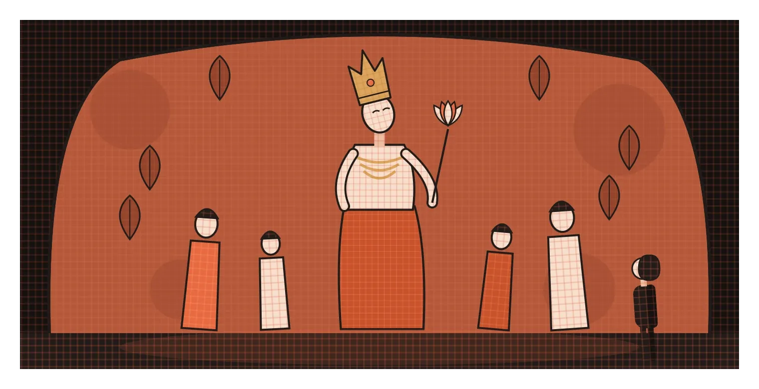
The setting adds another layer. The interiors of the caves are dim, and the paintings were meant to be seen in low, soft light, so that figures seem to emerge gradually as your eyes adjust. Even today, visitors see them under carefully controlled lighting. It's a reminder that emphasis isn't only about the design itself. The way something is lit, framed and approached can make a focal point feel quiet and intimate rather than loud. Padmapani doesn't shout for attention. He simply holds it, which is what the best focal points do.
On screens, every view needs one clear job
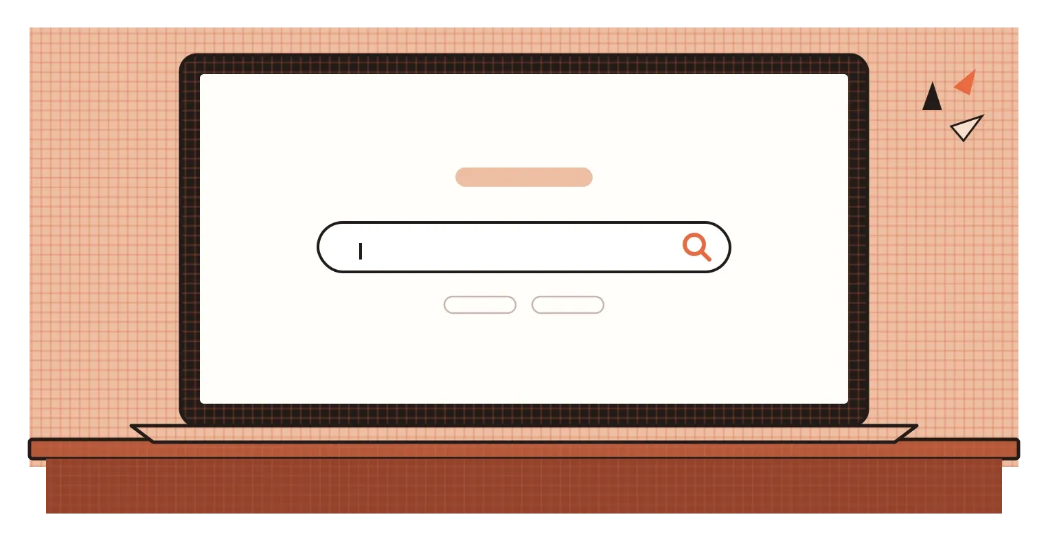
The Google homepage is probably the most famous focal point on the internet. Since the late 1990s, it has looked roughly the same: a logo, a single search box surrounded by a lot of empty space, and a couple of small buttons. There's almost nothing else to look at, so your eye goes straight to the box and your hands follow. It's isolation used at its simplest and most effective. Most products can't be quite that minimal, but the principle carries over. Each screen or view usually has one main thing someone is there to do, and the design should make that thing the focal point.
Guidelines for interface design often build this in. Google's Material Design, for example, describes a prominent floating action button for a screen's main action and recommends using only one per screen, because a second would compete with the first. Many design teams follow a similar rule of thumb for buttons in general: one filled, high-contrast primary button per view, with any other actions shown in quieter styles. When that rule gets broken, and a screen has several equally loud buttons, users often hesitate or pick the wrong one.
I saw the value of a clear focal point while working on an agentic AI system at Rocketium. In our second version, before the AI did anything, the designer saw a short checklist of the steps it was about to take, visible from the very first message. Each AI response then followed the same structure, with the output shown as a distinct card that clearly displayed its status, such as waiting for the designer's action or done. In effect, every moment of the workflow had one obvious place to look. It's a small change to describe, but it changed how confidently people moved through the work, because they no longer had to search for what mattered.
Choose the spotlight before you light the stage
Emphasis is where all the earlier elements and principles start working together towards one goal. Point, line, shape, value, colour, texture, balance and contrast all become tools for answering a simple question: where should someone look first? Caravaggio answered it with a beam of light, the Ajanta painters with scale and stillness, and Google with an empty page and a single box. The methods are different, but the decision behind them is the same.
The habit I'd suggest is to make that decision before you start designing, not after. Write down, in one sentence, what you want people to notice first on this page, screen or poster. Then design everything to support it. When you review your work, try a quick test: show the design to someone for three or four seconds, take it away and ask what they remember. If they name your intended focal point, it's working. If they mention something else, a decorative image, a secondary button or an unexpected face in a photo, then something is stealing the spotlight, and it's usually easier to quieten that element than to keep making your main element louder.
It also helps to remember that a focal point is a promise. When you pull someone's eye to something, you're telling them it matters. If what they find there is useful, clear and worth their attention, they'll trust the rest of the design to guide them too. If it's a distraction or a trick, they'll learn to ignore your spotlight altogether. Caravaggio's beam of light falls exactly where the story is happening. That's what every focal point should do: lead people straight to the thing that matters, and then get out of the way.
Further reading: Chris Kelly Friesen and Alan Kingstone, "The eyes have it! Reflexive orienting is triggered by nonpredictive gaze" (1998) · Rudolf Arnheim, Art and Visual Perception (1954) · Google, Material Design guidelines